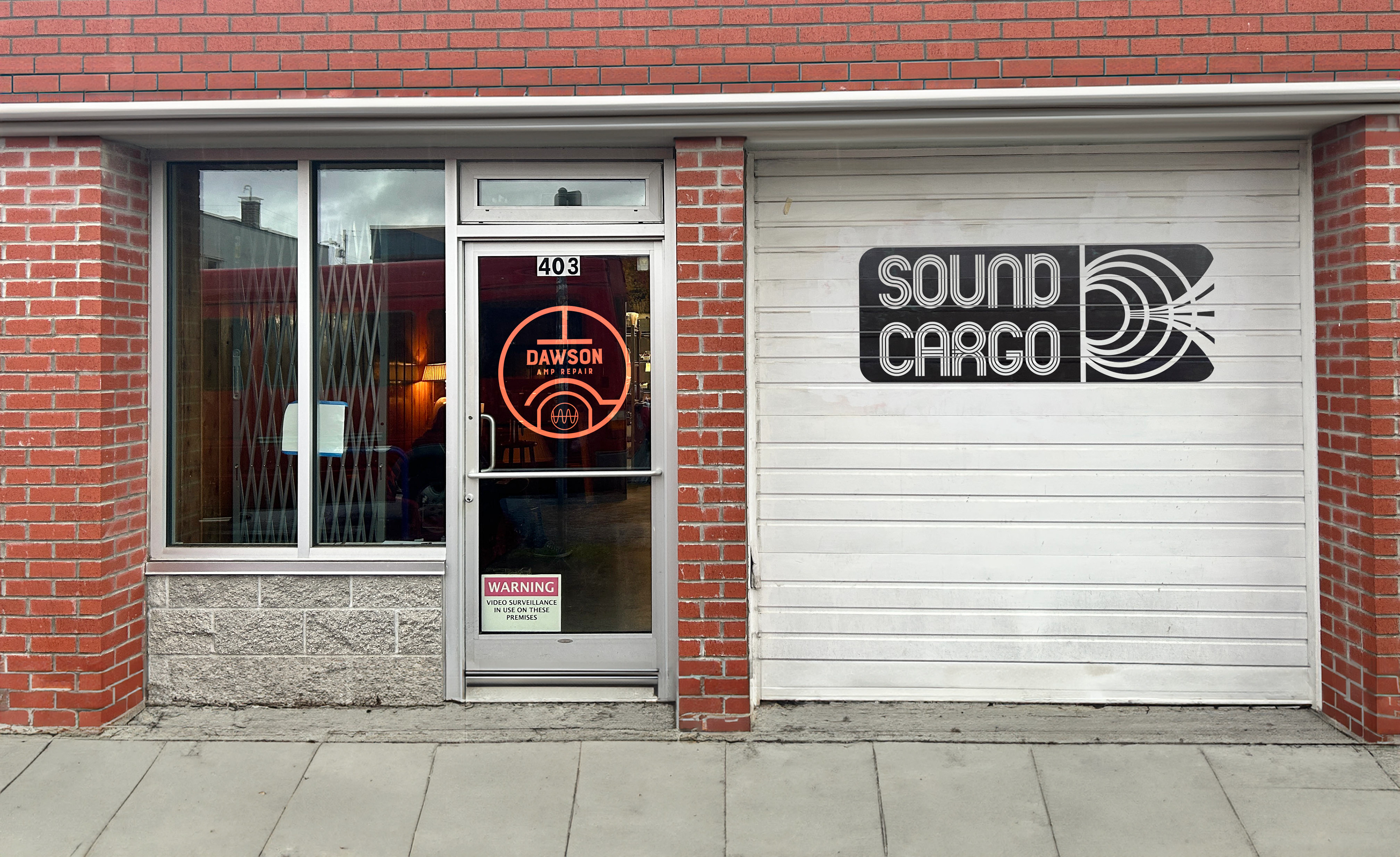
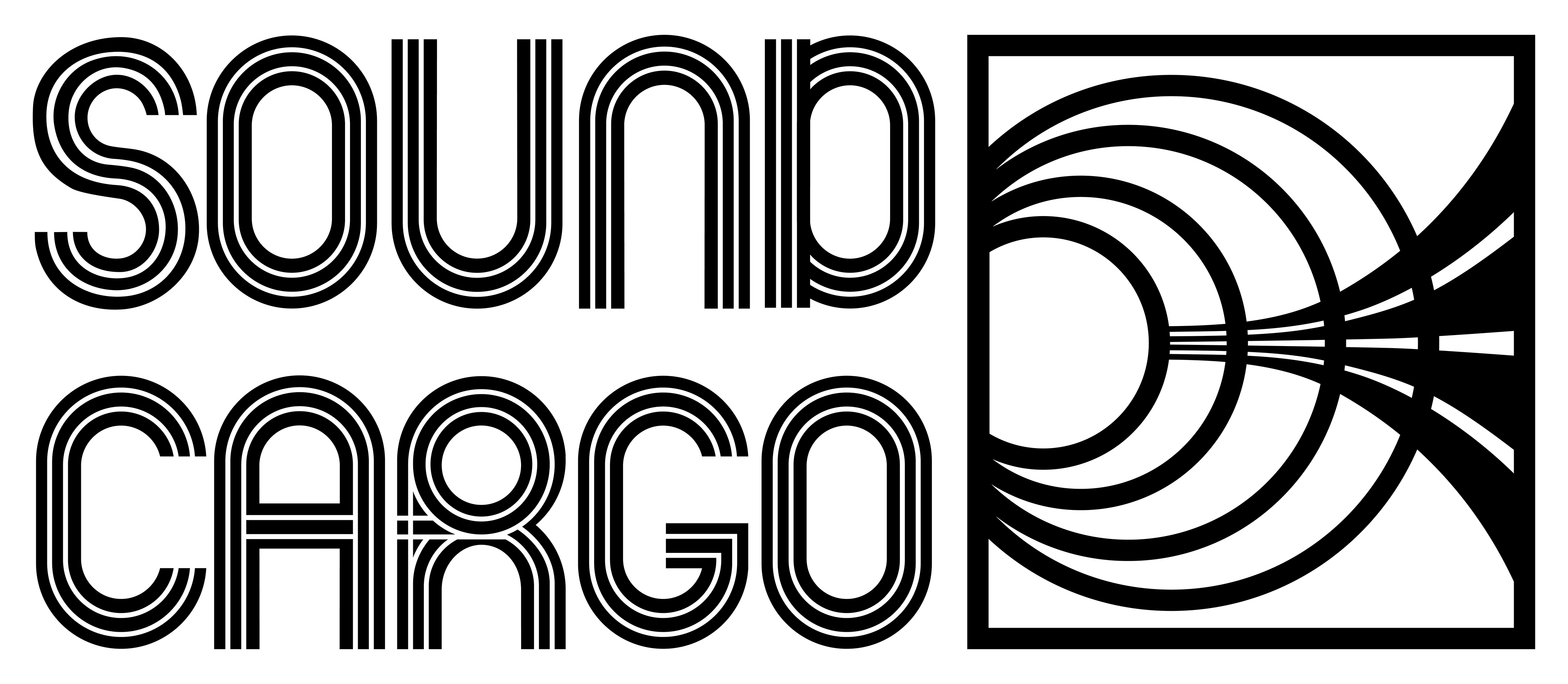
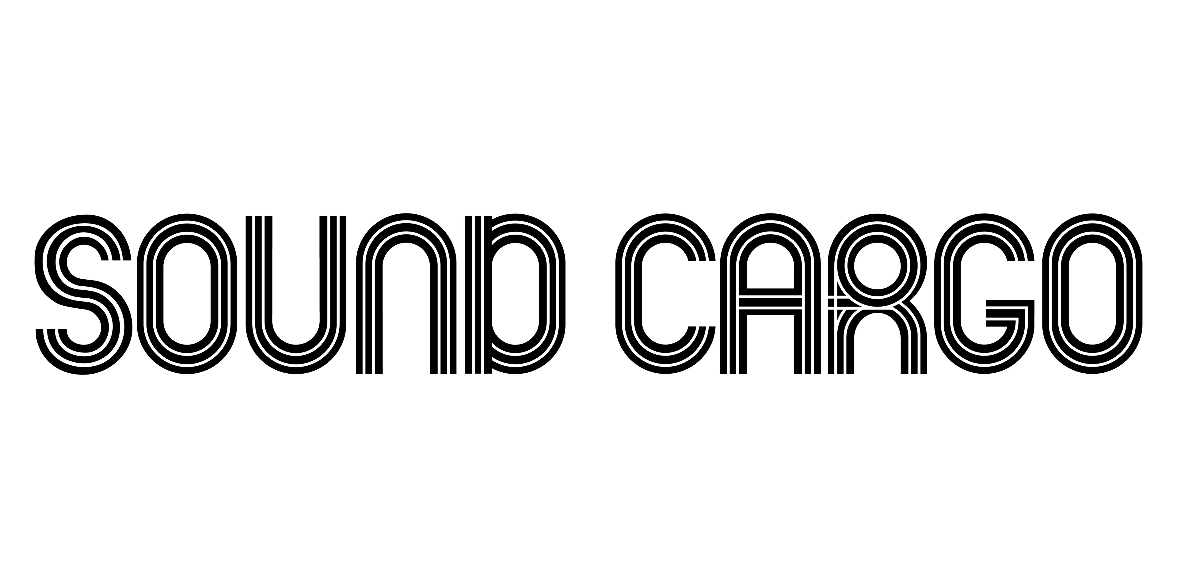
Sound Cargo
Sound Cargo and Dawson Amp Repair are Portland's local specialists in vacuum tube gear. I crafted a vibrant retro aesthetic that speaks to their audience of vintage tube amp-loving musicians with the capacity to expand and grow with the business.
The Problem
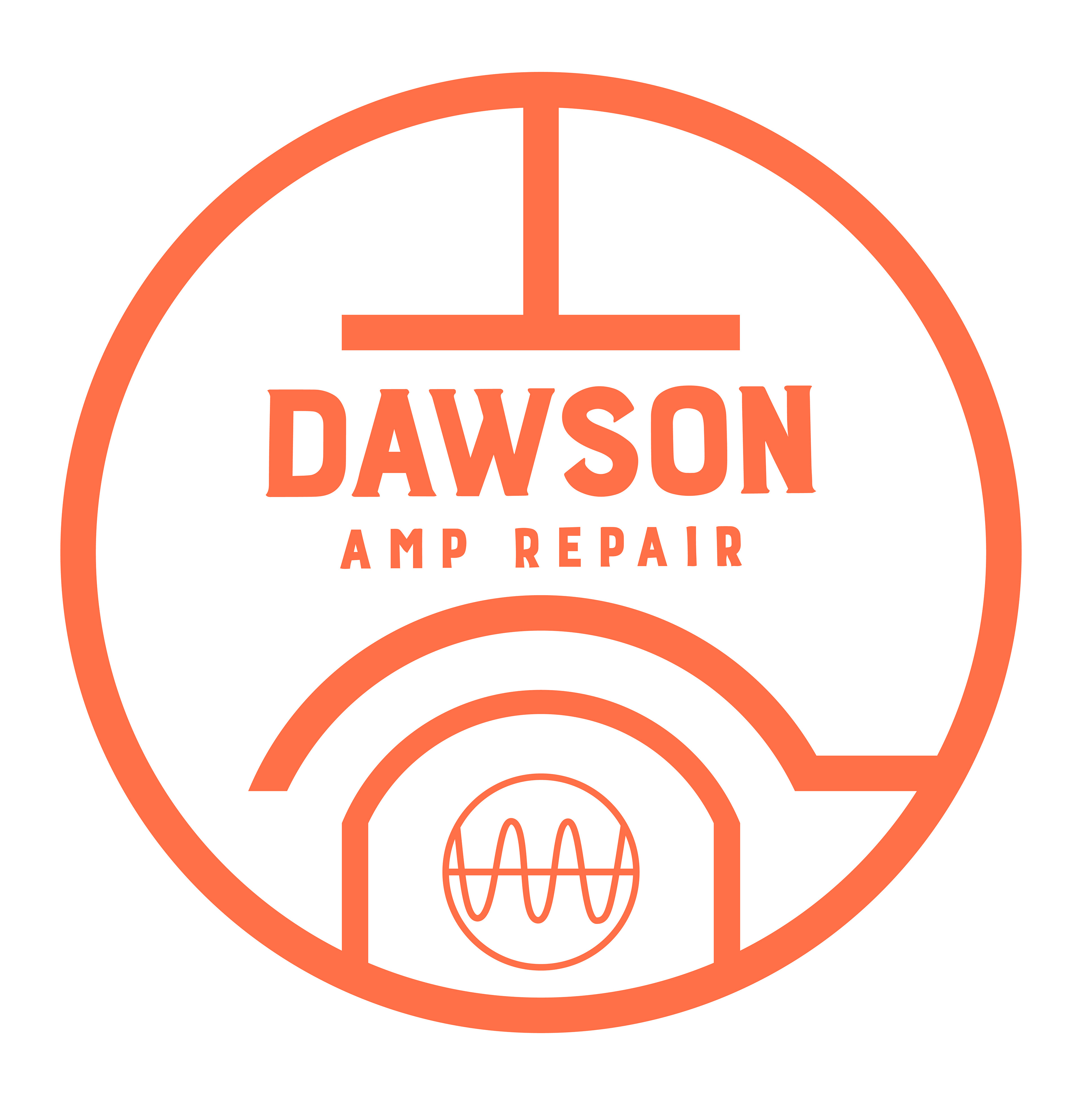
Matthew Dawson came to me hoping I could bring his love of the bright colorful graphics of the 1970s to his new business branding identity. Specifically, he needed me to update the branding for Dawson Amp Repair, fine-tune his website, and create the branding identity for his new venture building boutique custom tube amplifiers—Sound Cargo.
The Solution
Inspired by the typography and design of the 1968 Mexico City Olympics and a visual language that immediately resonates with our mutual demographic of musicians and artists, the design system incorporates the iconography of electrical engineering and vintage electronics.
What I did
• Design Direction
• Branding & Identity
• Research
• Logo Design
• Competitive Analysis
• UI Design
• Prototyping
• Illustration
• Web Design
• CSS
Tools
• Illustrator
• Photoshop
• Figma
• SquareSpace
• Procreate
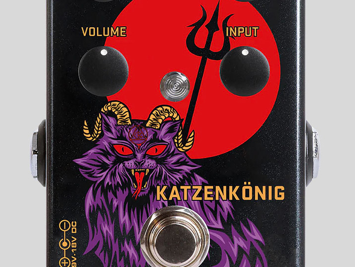
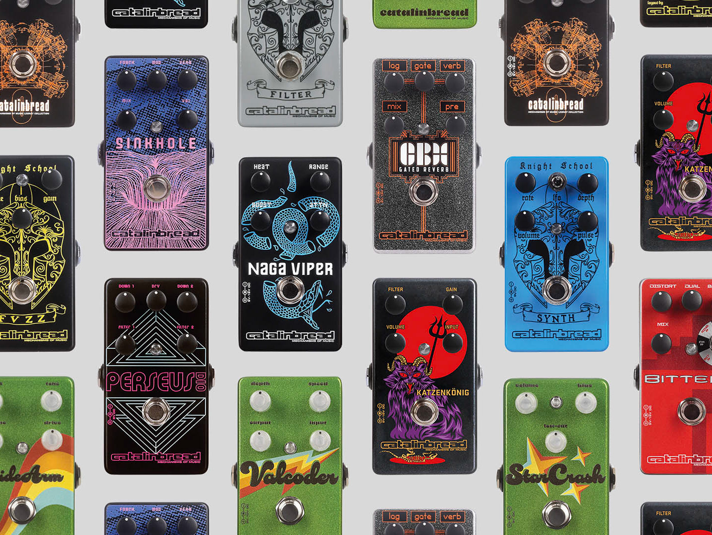
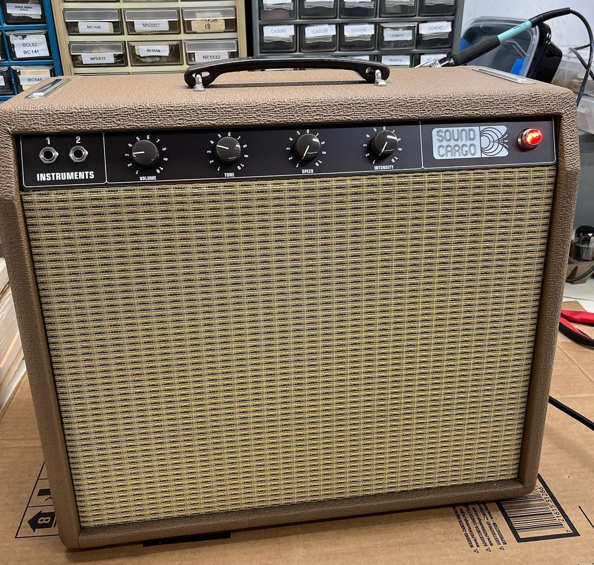
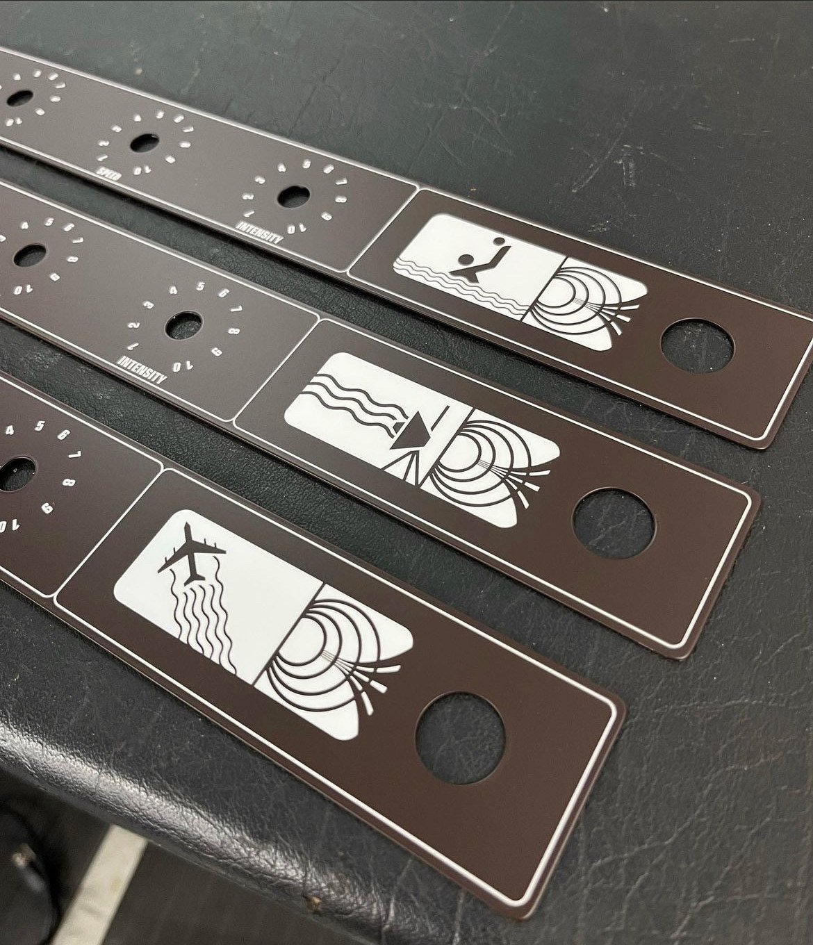
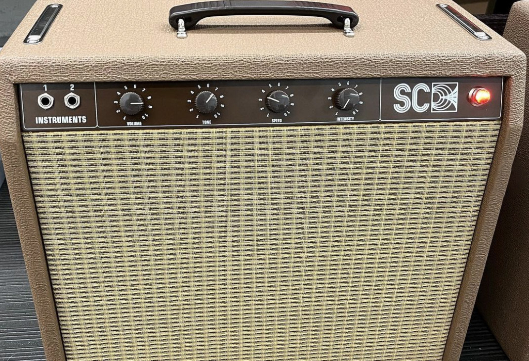
Kit Build Faceplates
We designed a secondary series of faceplates for DIY kit builds utilizing the sound wave speaker logo and playful vector illustrations in the same style rather than the Sound Cargo wordmark.
Logomarks
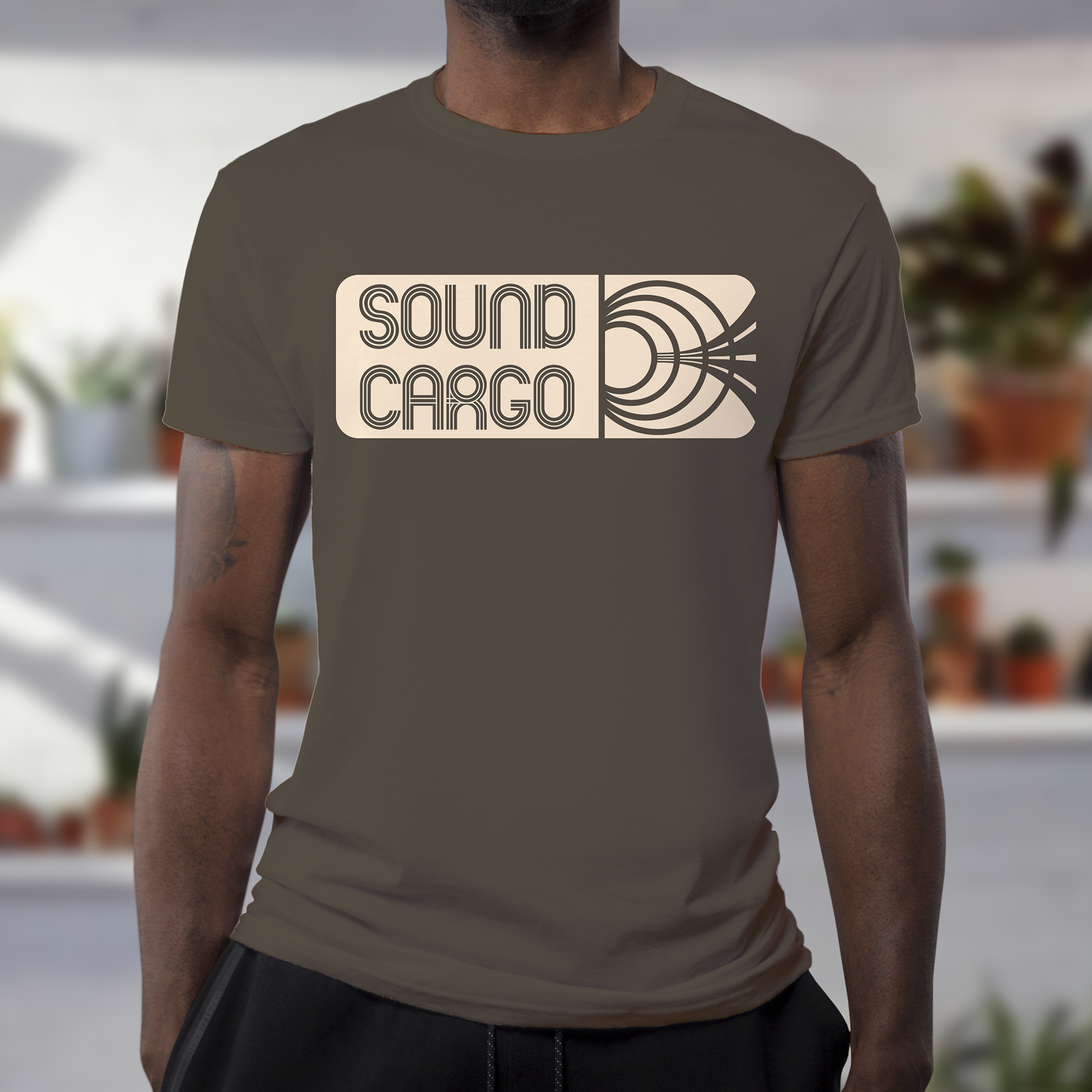
The logos incorporate the visual language of vintage electronics, circuit board wiring diagrams, and the big bold geometric design of the 1970s.

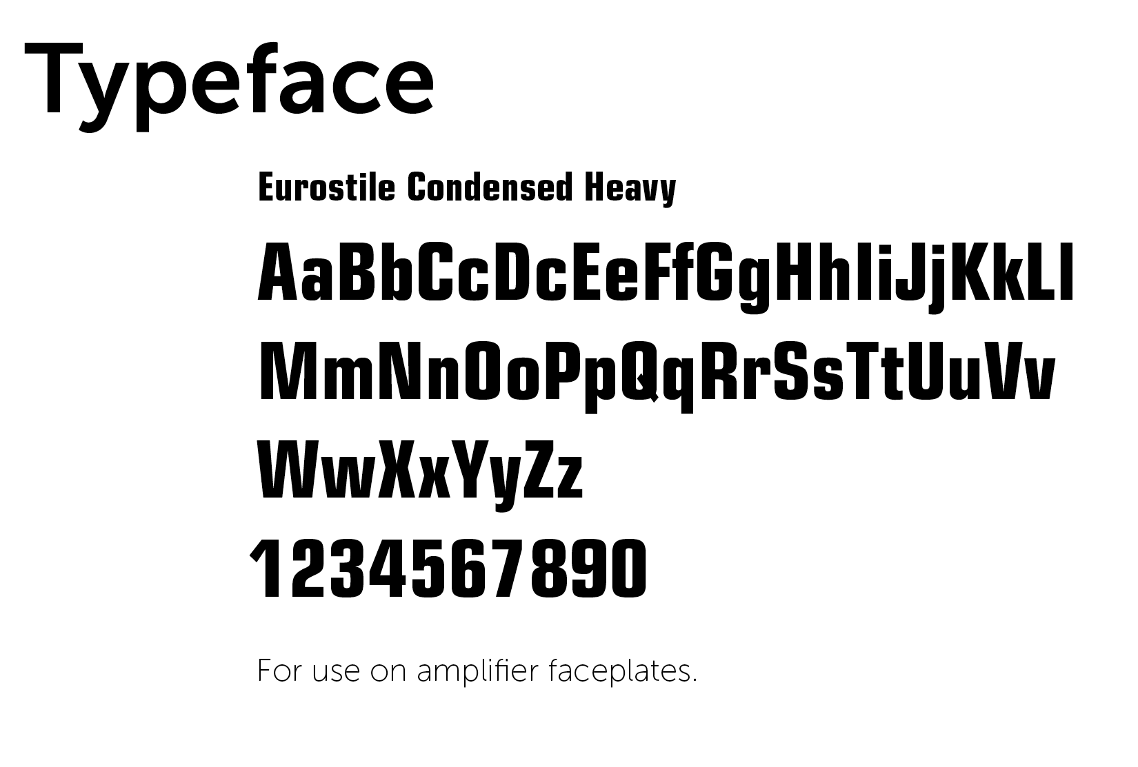
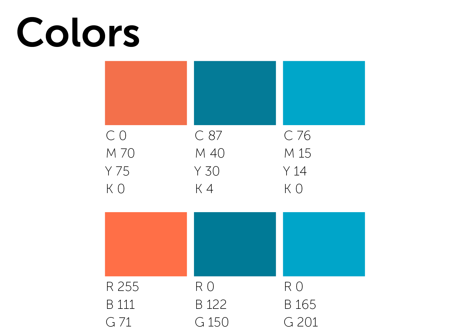
Styleguide Typography & Colorways
Tee shirt mockup
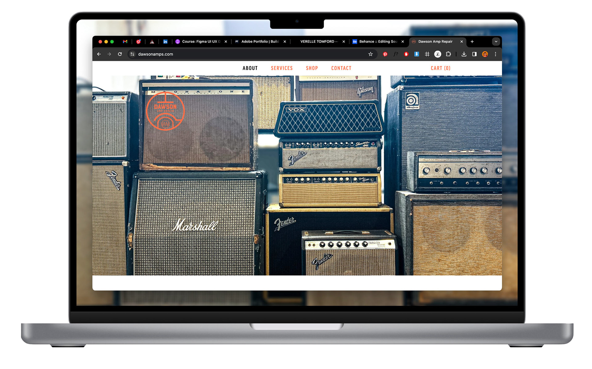
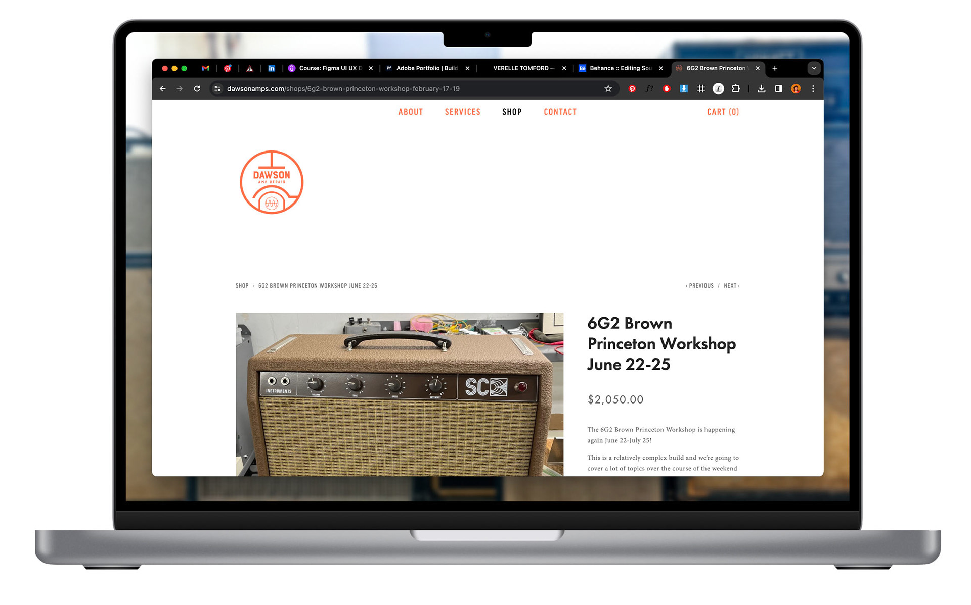
Website Interface
After creating the branding identity, I applied the text, color, and logo treatments to their SquareSpace site.
Visit the website
Reflections
Working with Matt has been a blast and we plan to continue expanding on his dreams for this project with more amp faceplate designs, environmental design with wall murals, shirts, expanded website components, and more!