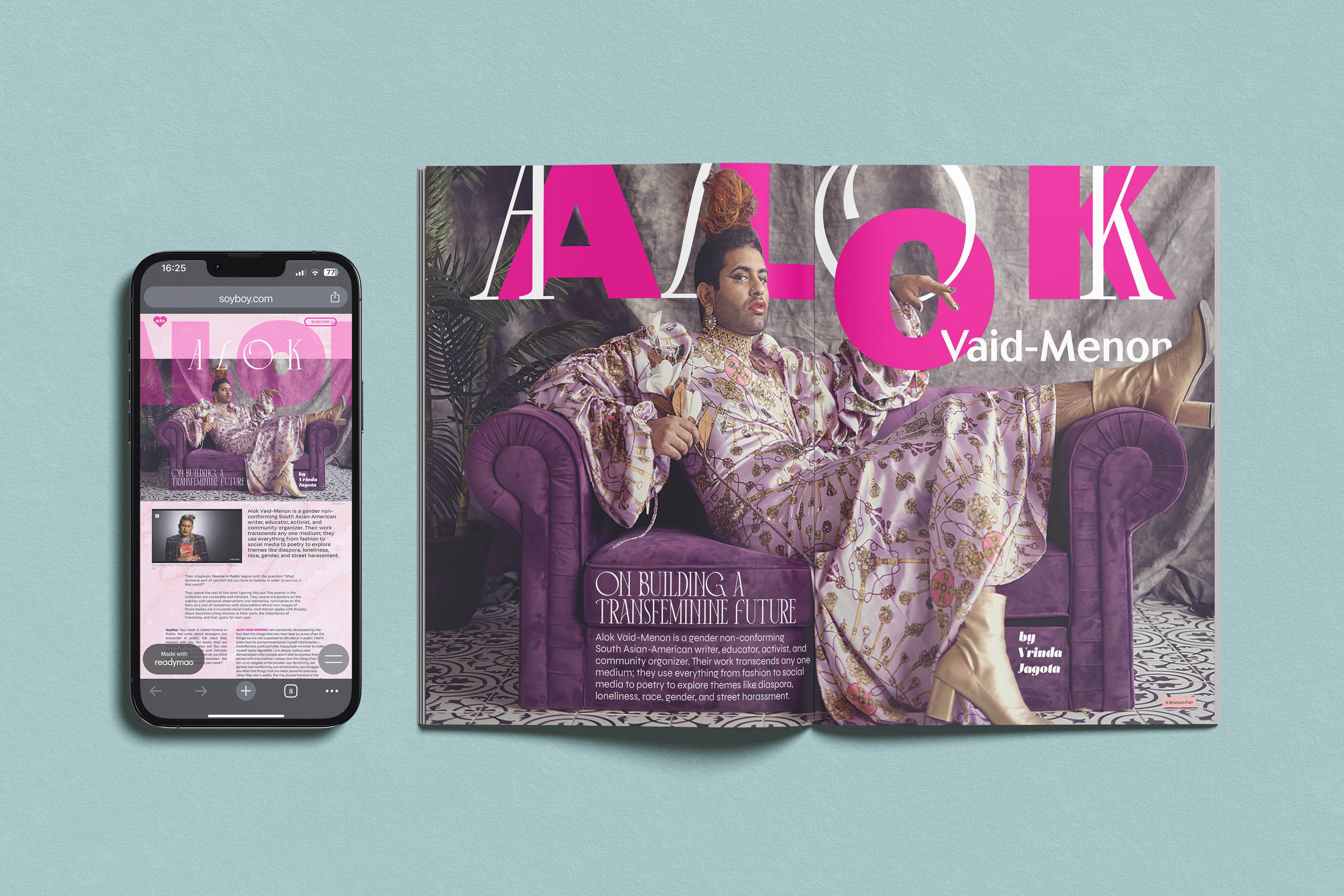
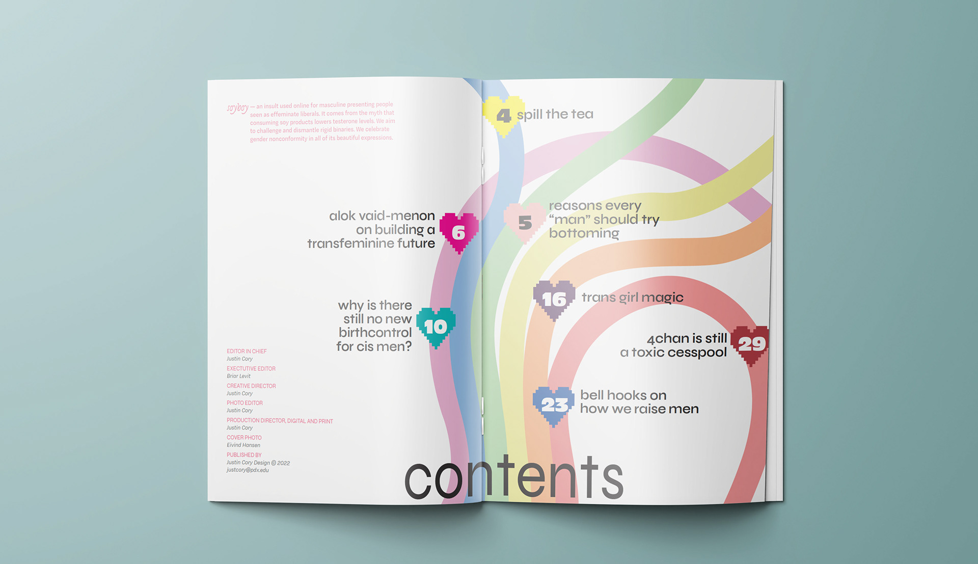
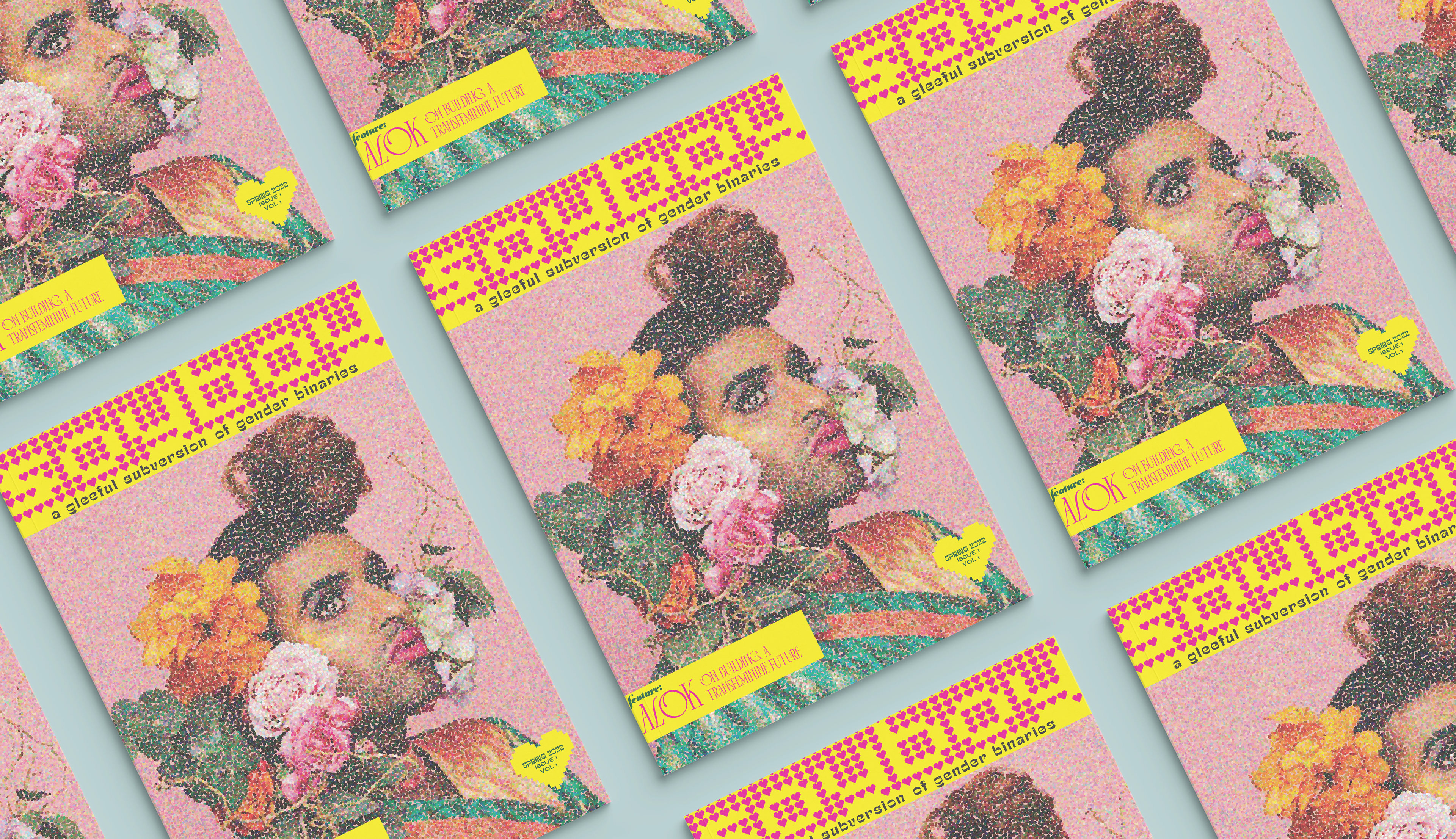
Soyboy Magazine
I designed and branded this magazine project as an irreverent and playful feminist dismantling of masculinity and the gender binary aimed at masculine-socialized or masculine-identifying readers. Once the magazine branding and layouts were complete, I then translated one of the feature spreads from a print layout to an interactive web interface using ReadyMag.
A primary goal was reclaiming the epithet "soyboy" as a point of pride and highlighting the beauty and artistry within LGBTQIA+ and feminist communities.
What I did
• Concept
• Copywriting
• Typographical Layout
• Print/Prepress Production
• Branding & Identity Design
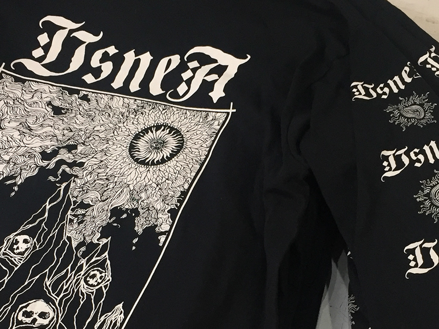
• Illustration
• Prototyping
• Motion Design
• Competitive Analysis
• UI Design
• Mock-ups
Tools
• Illustrator
• Photoshop
• InDesign
• Readymag
• Figma
• Procreate
Link to the digital feature:
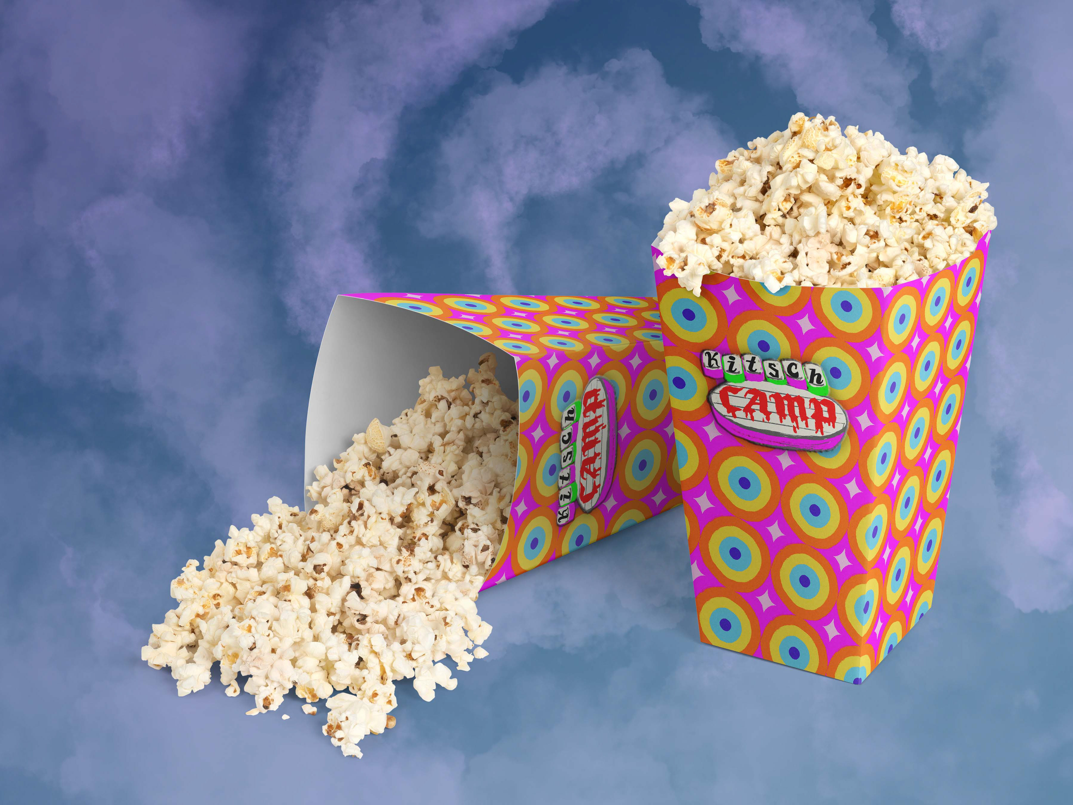
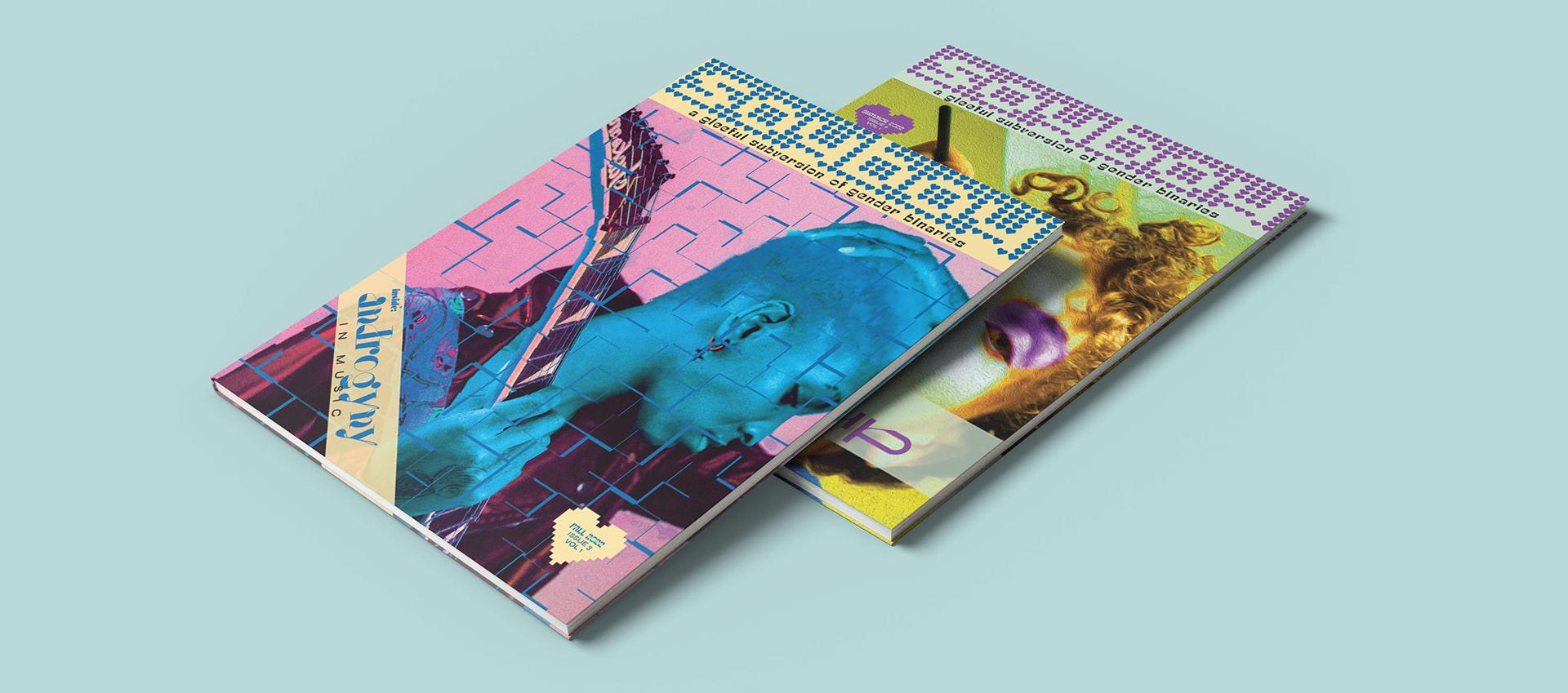
Covers for Other Issues
I had fun expanding the branding identity design system through explorations of color, photo treatments, and typography for future issues of Soyboy.
Reflections
I grew up in the DIY punk fanzine space so creating a more polished magazine was immensely fun. I also learned from some of the mistakes I made on the magazine project I designed at Portland Community College and applied that knowledge in the development of this one.
Overall, I learned so much about dynamic typography, layout design, and translating print media for the web while making this project for Professor Briar Levit's Layout Design class at Portland State University.