Body Mind Peace
I designed this massage interface to embody the elegance and relaxation of the experience itself with the eponymous brand mantra: body, mind, and peace. This project brief was part of a User Interface Design class in my senior year of undergrad at Portland State University.
The Problem
Many massage & beauty service user interfaces are cluttered and generic and feature unclear/redundant action items.
The Solution
Through three stages of research, competitive analysis, personas, and strategic user journey mapping; I was able to design a UI system that is inviting, intuitive, spacious, and sophisticated.
What I did
• Design Direction
• UX Testing
• UI Design
• Strategy
• Information Architecture
• Wireframes
• User Flows and Journeys
• Competitive Analysis
• Prototyping
• Branding & Identity Design
• Digital Illustration
Tools
• Figma
• Photoshop
• Illustrator
• InDesign

Strategy
In this phase, I looked for pain points and friction in current applications with an extra emphasis on accessibility and mobile-first responsivity.
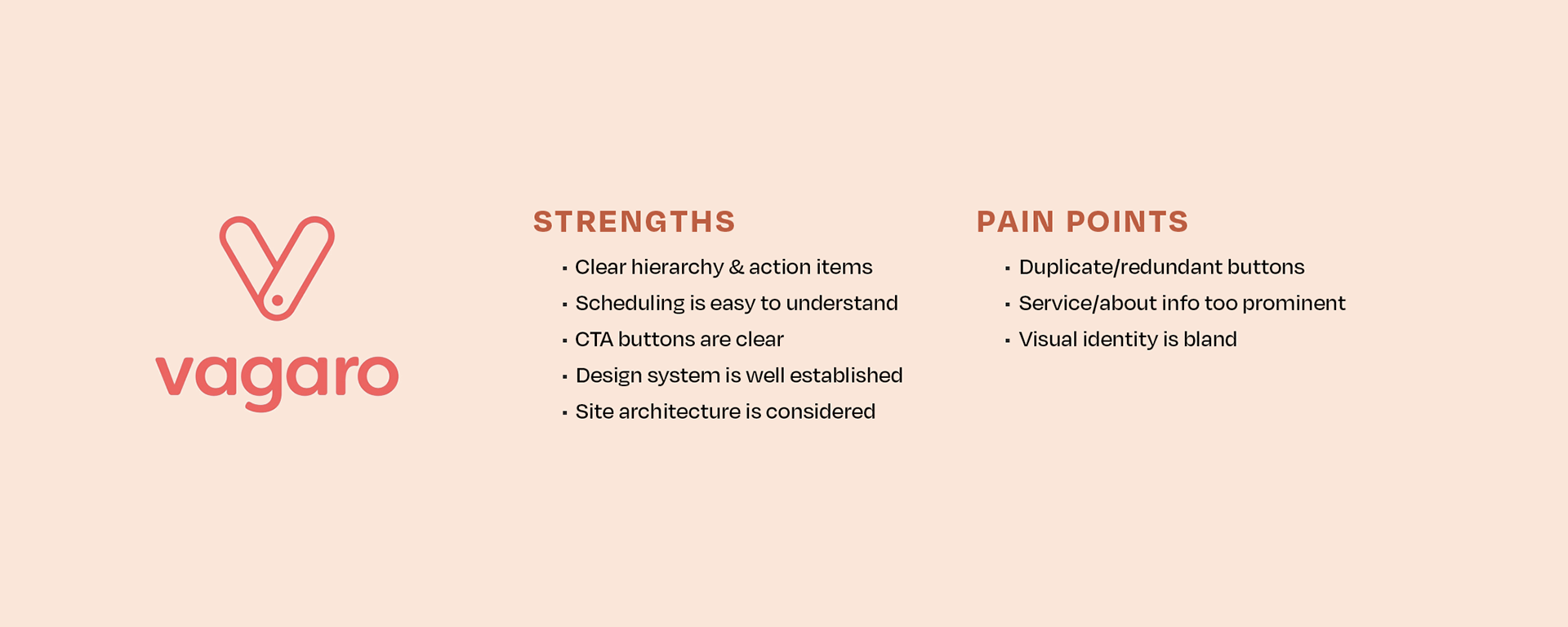
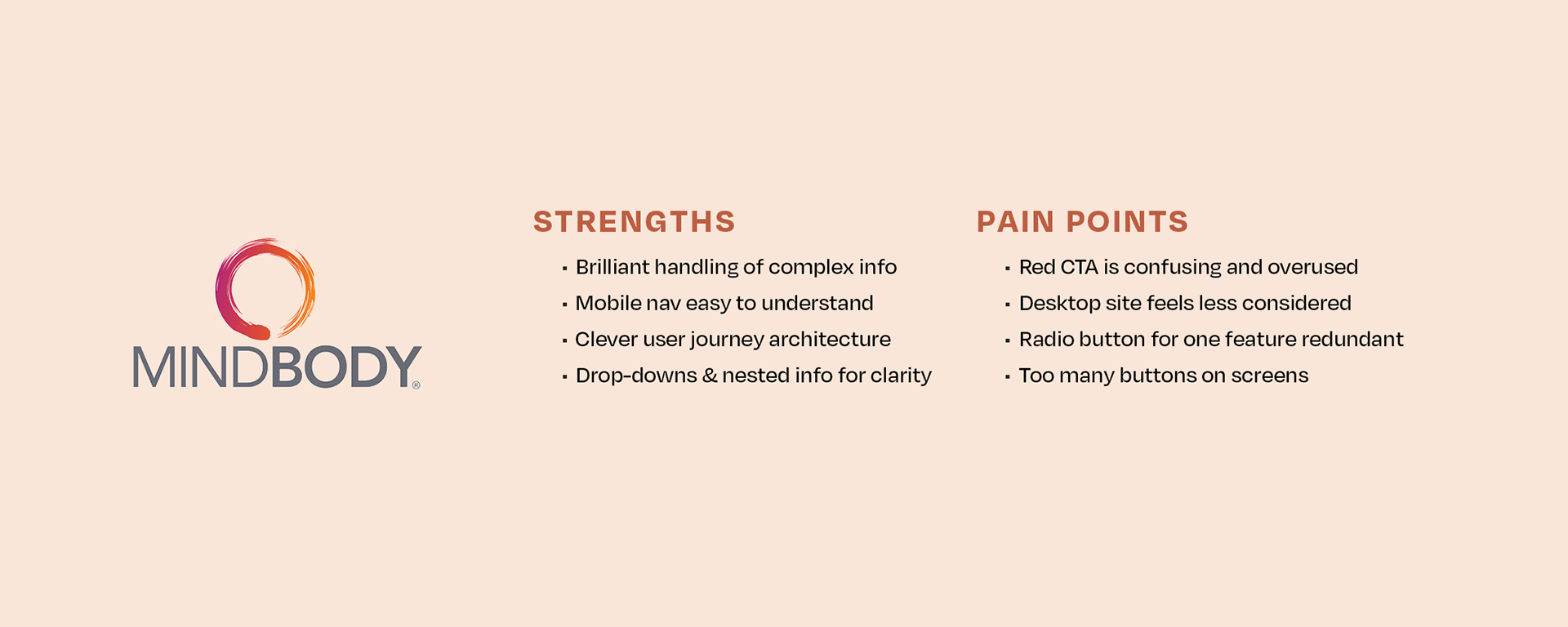
Competitive Analysis
There are strong competitor apps for health & beauty booking services but many are generic in design and often feature redundancies that deter and confuse users. Determining their Strengths, Weaknesses, Opportunities, and Pain Points was a crucial launching point for the design process of this interface.
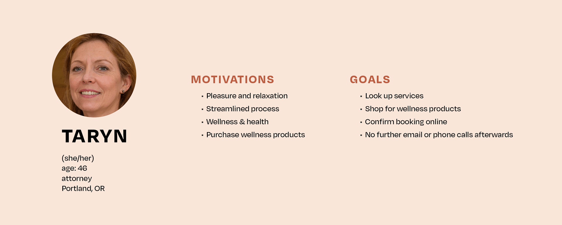
Persona
Tailoring the service to the user's motivations and goals helps keep the UI user-focused. Using these motivations and goals and understanding pain points led to the following questions:
• What are the minimum steps and screens to book or rebook a service?
• How can services and products be advertised in an elegant and inviting way?
• What feedback is necessary to provide cues to users without overwhelming them?
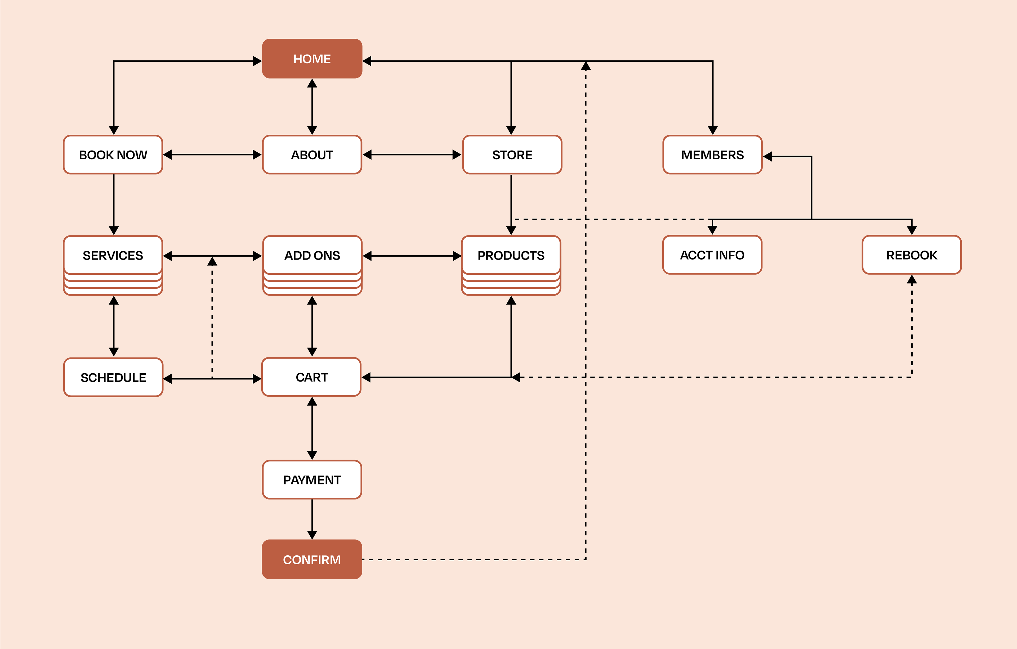
Sitemap
The user journey is the heart of the navigation system ensuring ease of use and fluidity.
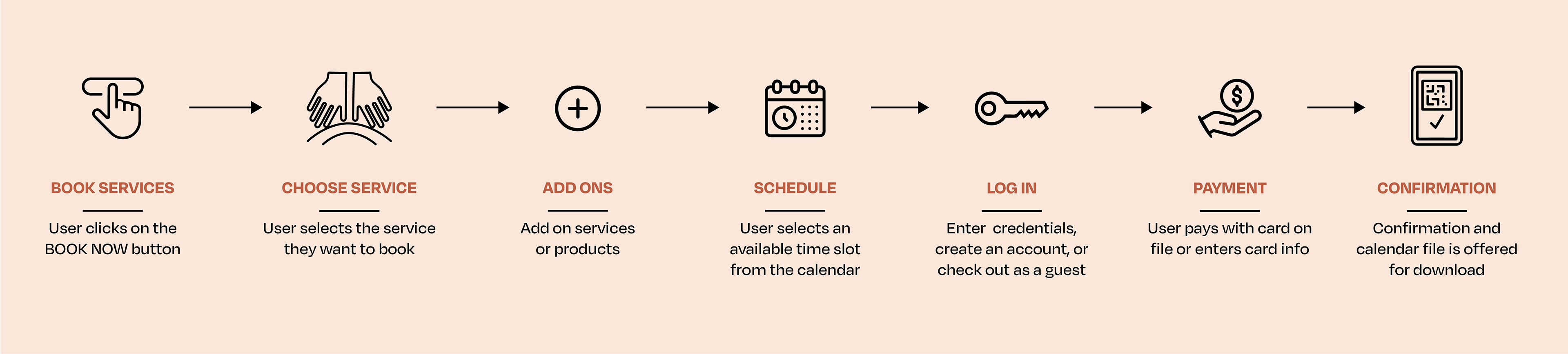
Feature Flow: Book Now
I mapped out every feature flow and screen flow necessary to achieve the minimum viable product. Below is the interaction breakdown for the service booking user journey.
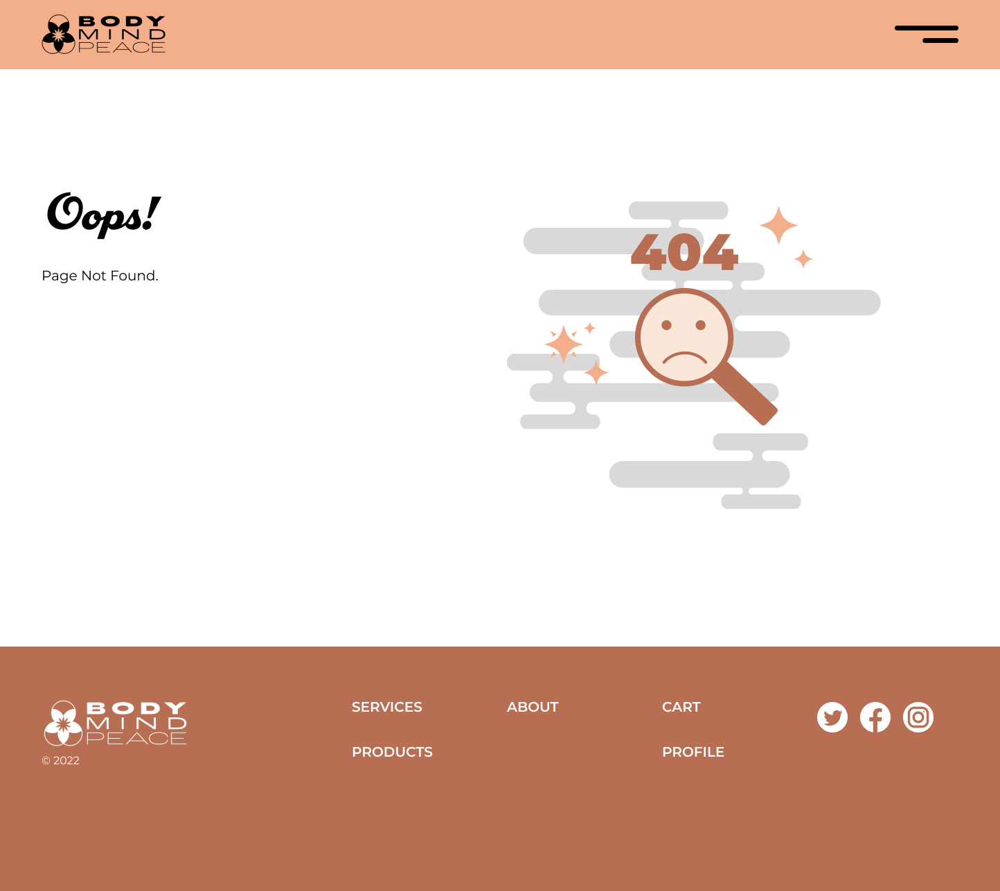
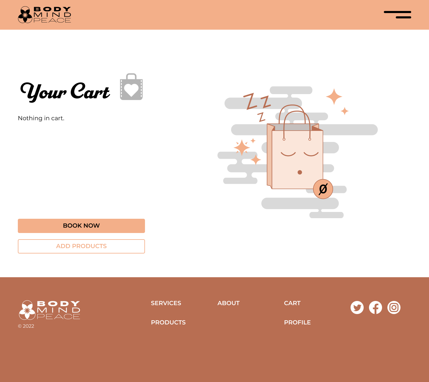
Vector Spot Illustrations
Shown below are two bespoke vector spot illustrations for blank states expanding the design system to ensure that there are no generic components in this design system.
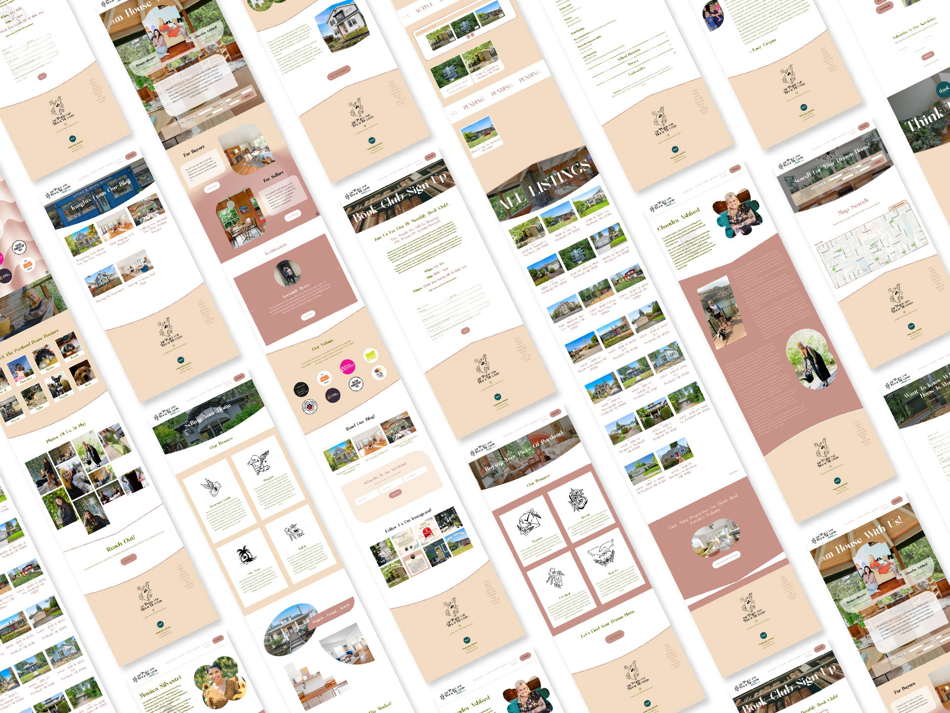
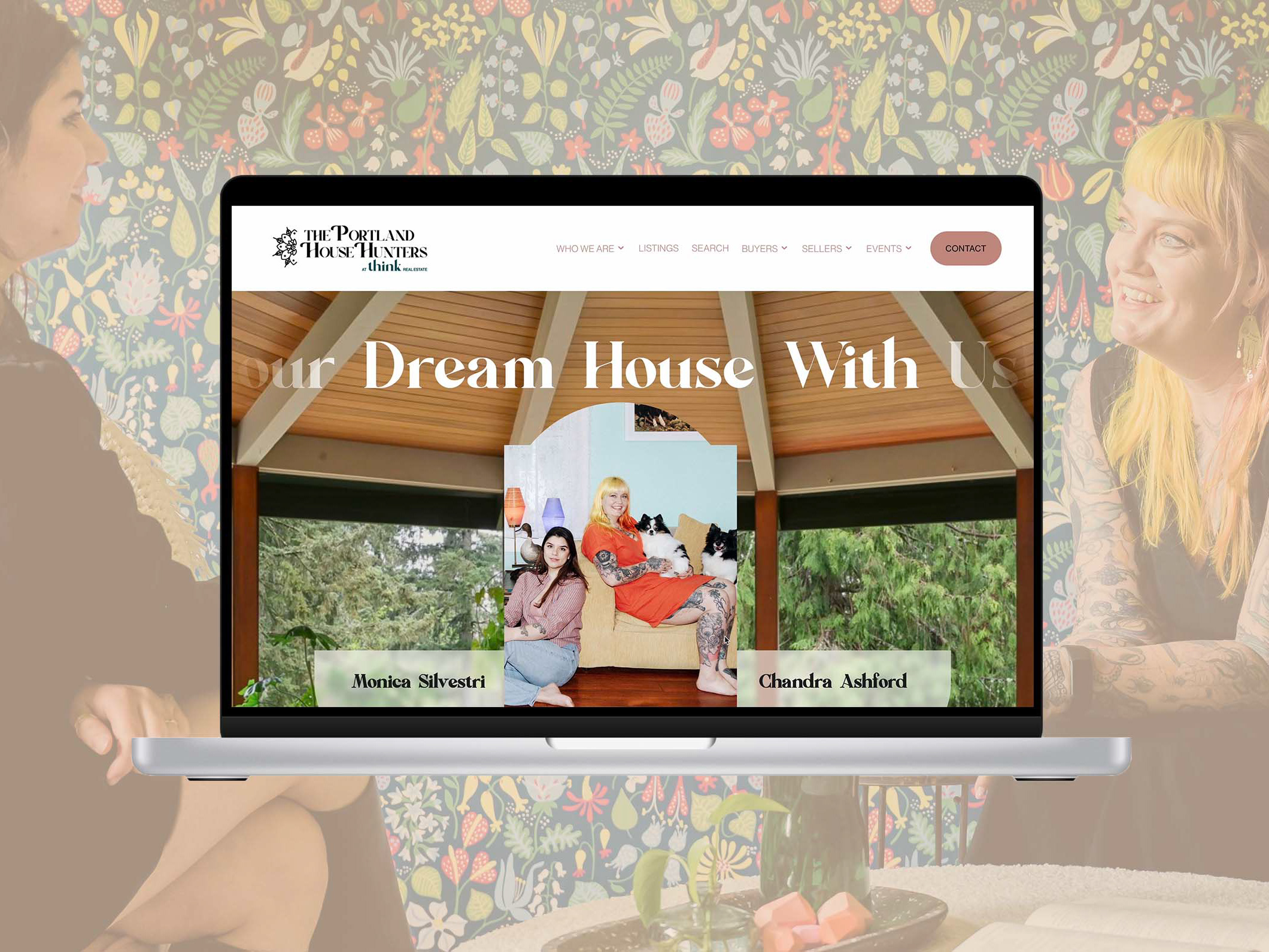
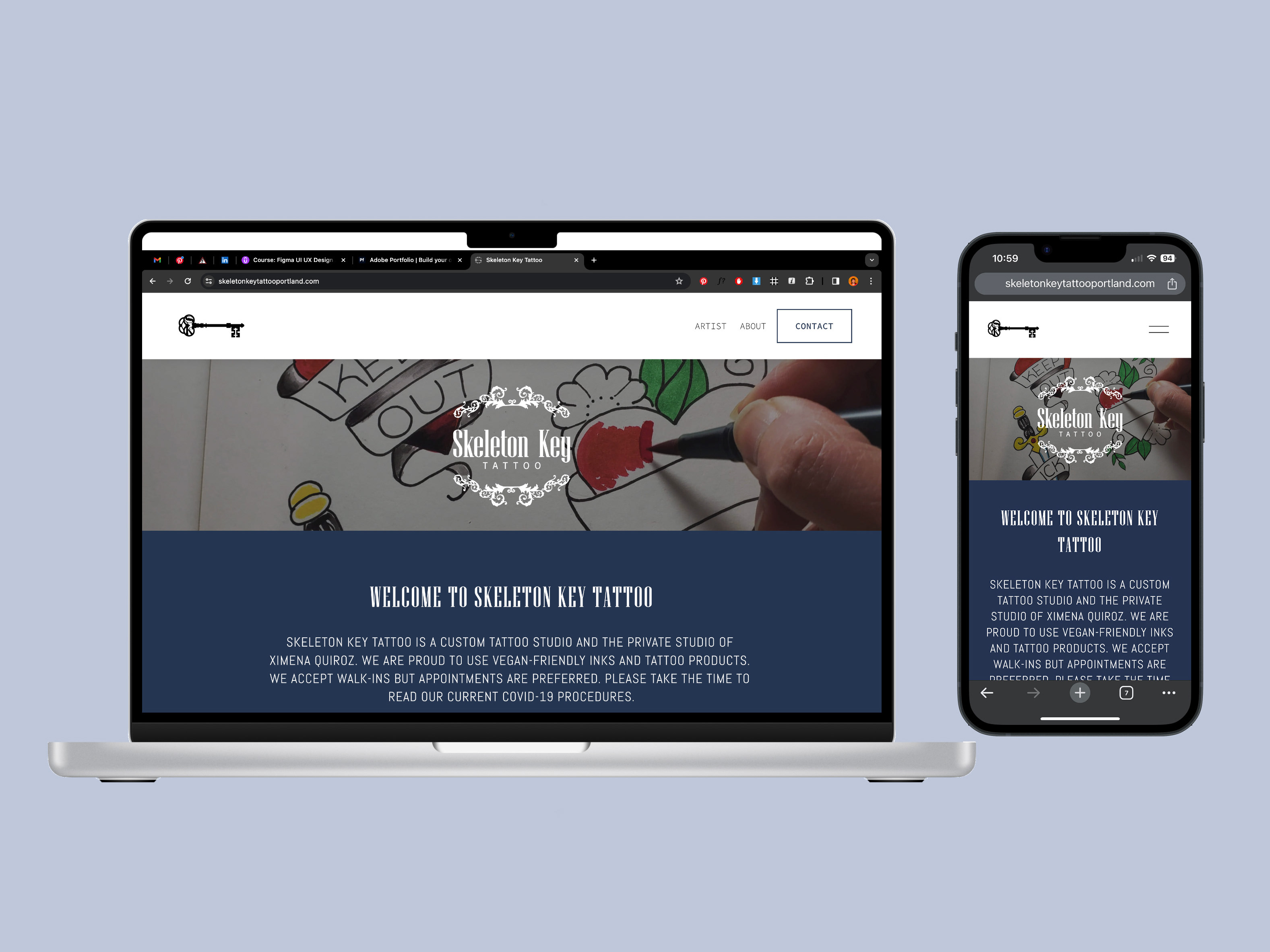
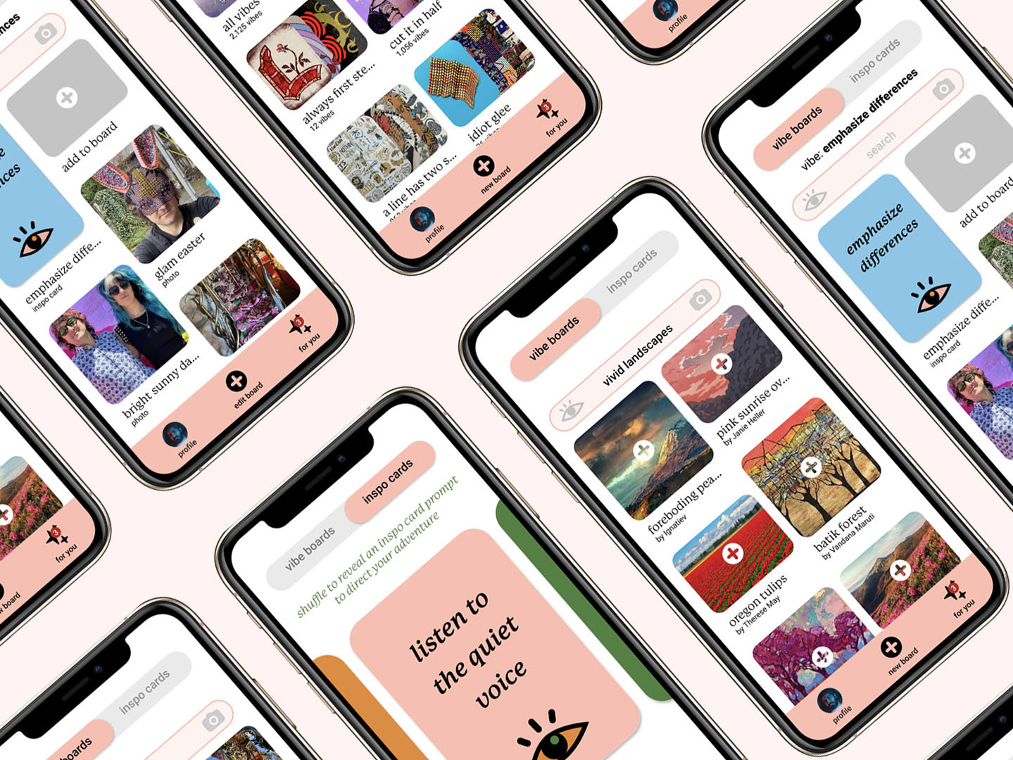
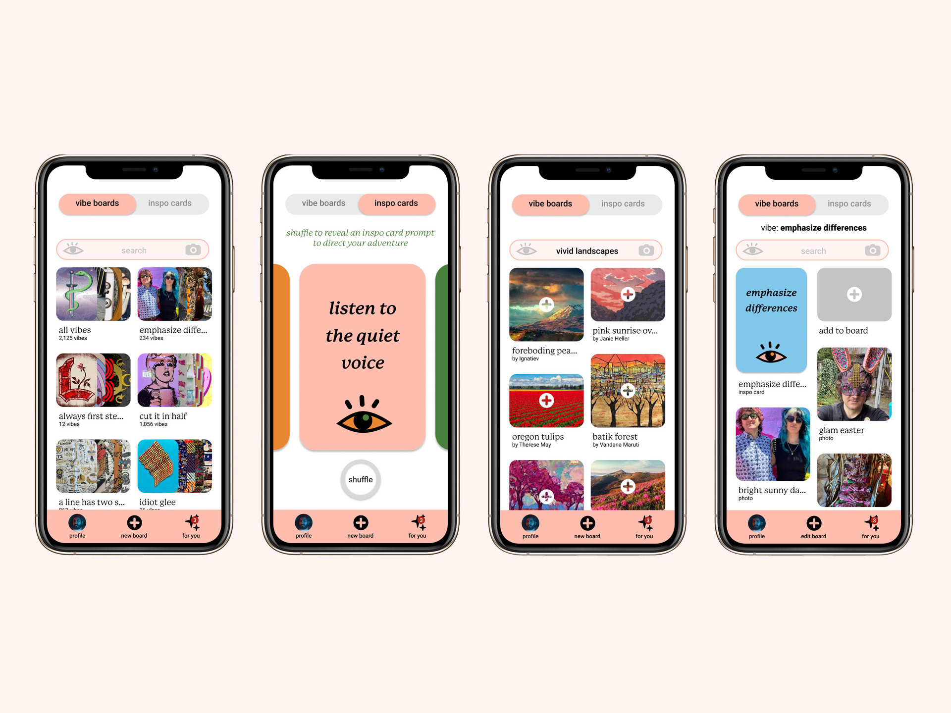
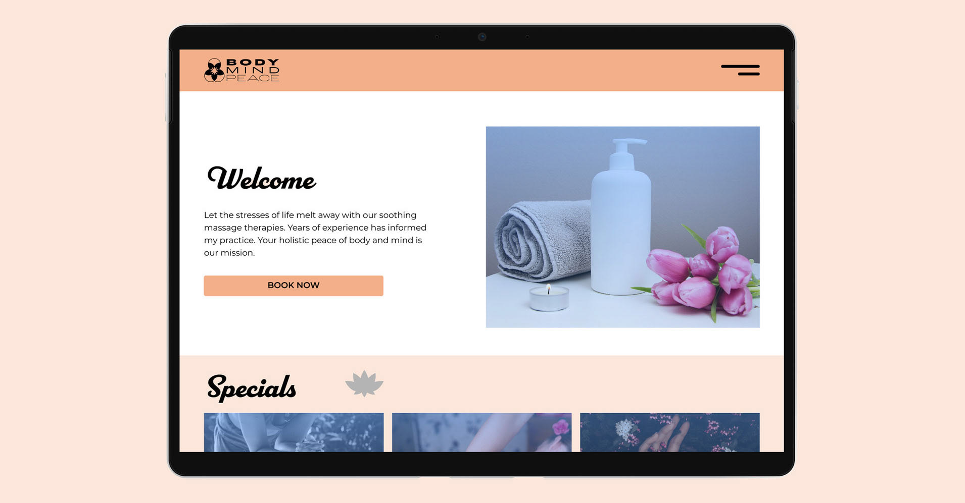
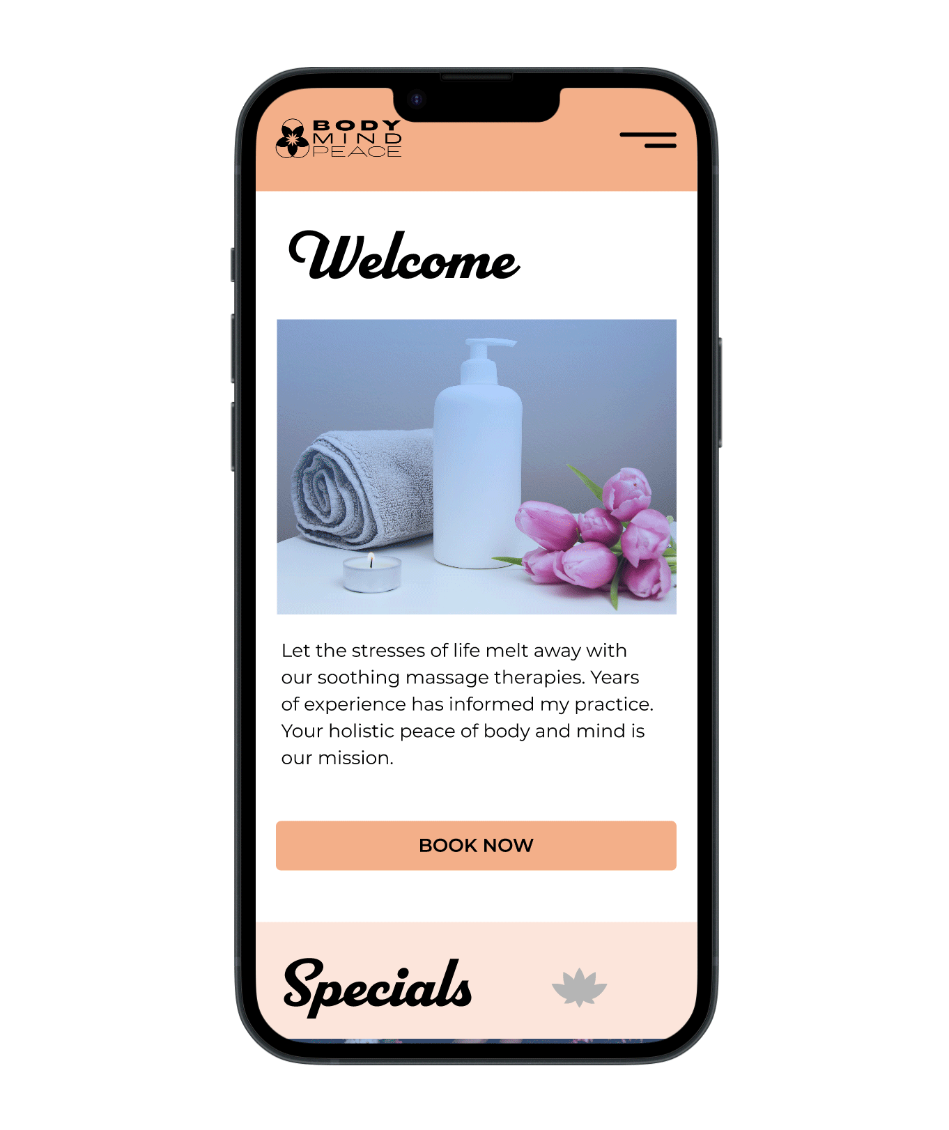
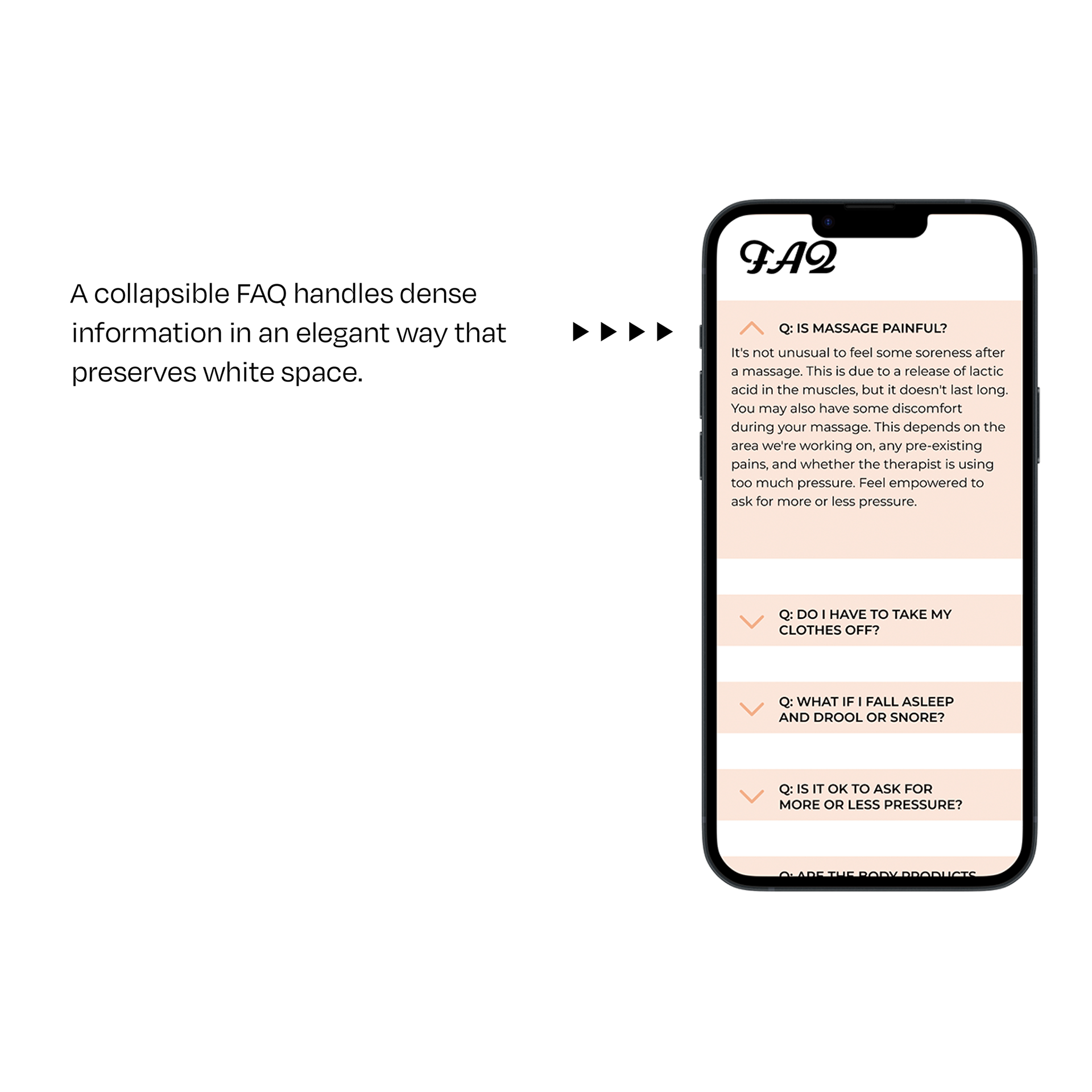
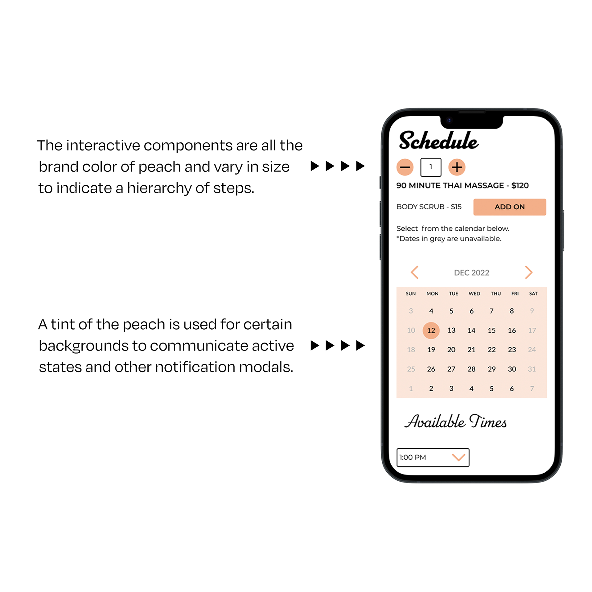
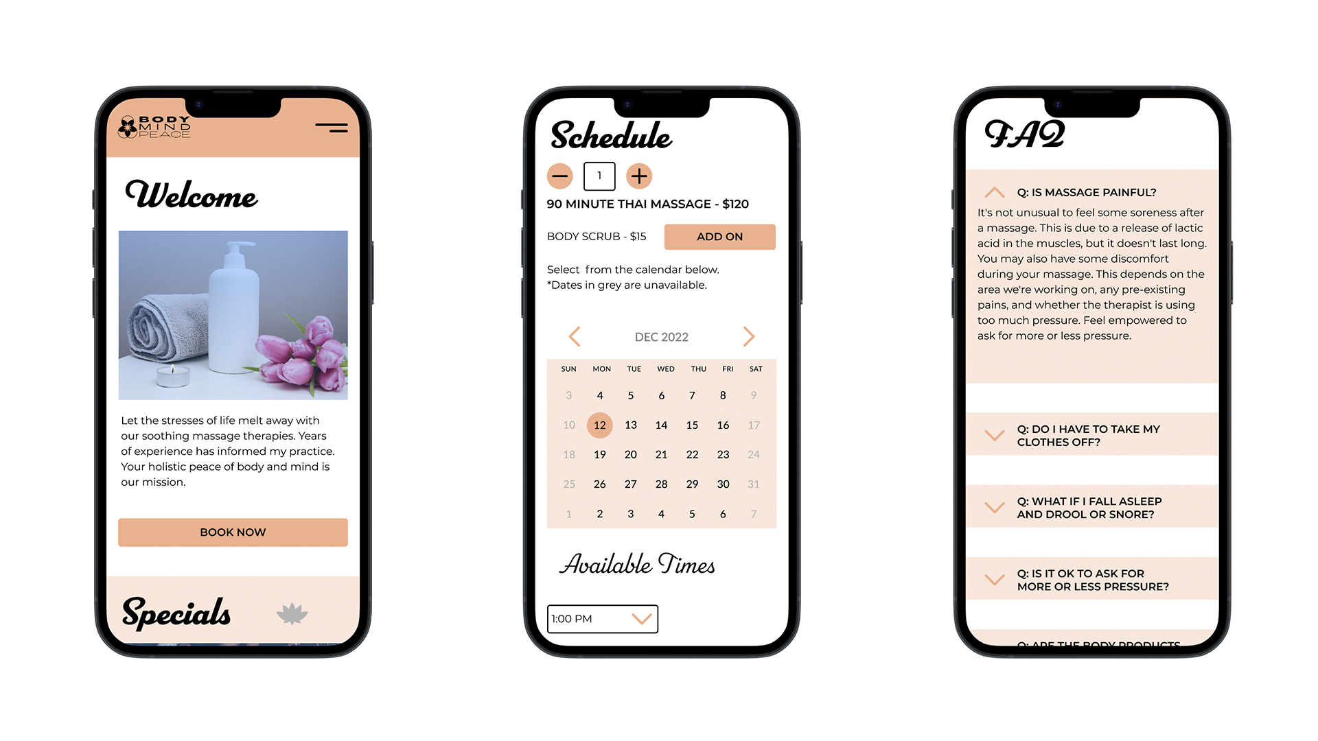
Final UI Screens
Reflections
This process taught me how important it is to take the best aspects of existing interfaces and iterate on them to increase efficiency and ease of use. The blue-tinted color treatment for product photos with a peach-orange primary color palette invokes a striking complementary contrast while still creating a calming mood. The generous use of white space between elements also serves to heighten this calming effect.
In the future, I would consider color contrast accessibility earlier in the process. The icon artifacts could also be developed further to increase the strength of the application and brand identity.