Skeleton Key Tattoo
I was hired by this local tattoo shop to rebuild their website and refresh the branding. My goals were to improve user functionality and amplify the personality of the business.
The Problem
Their previous website had excessive navigation items, redundancies in content, and an underdeveloped brand identity.
The Solution
I conducted extensive competitor analysis, research, iteration, and testing. Using the data from this, I built a streamlined website and brand system that conveyed the character and personality of the business while prioritizing the user's goals to boost bookings and revenue.
Before & After
The previous site was hosted on WordPress. It had 9 separate pages in the navigation menu and had the same content in multiple places creating a long wall of text and scroll length.
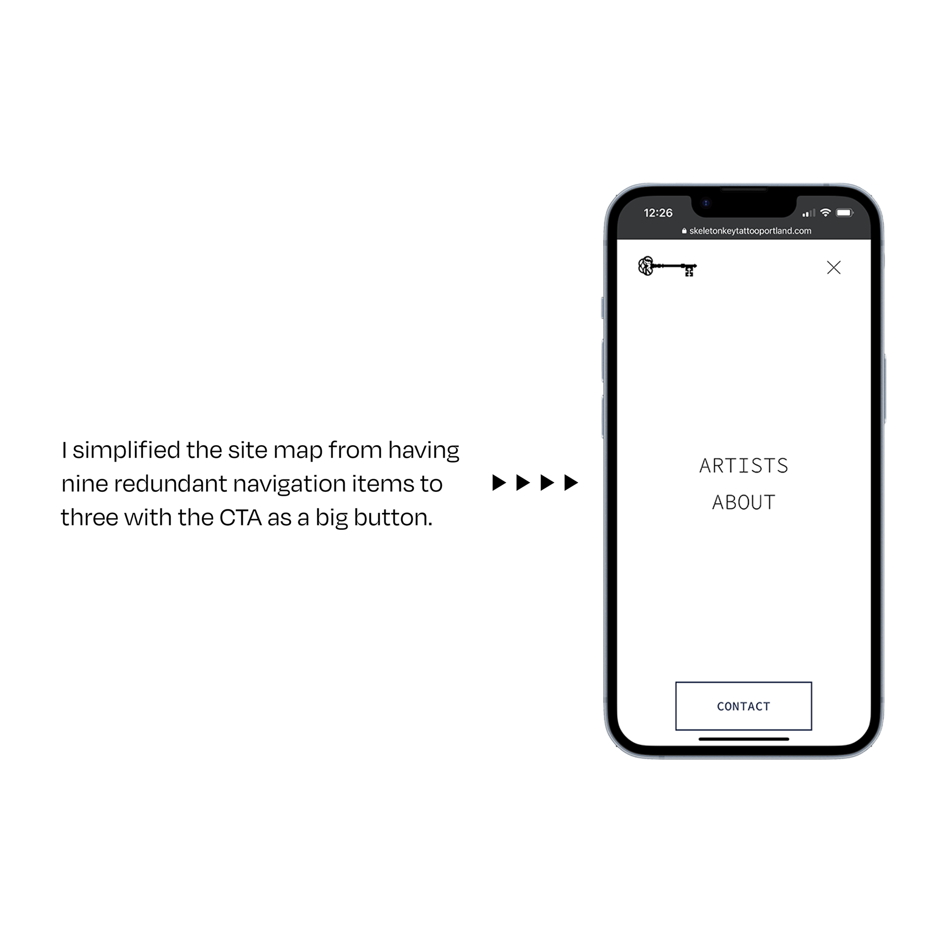
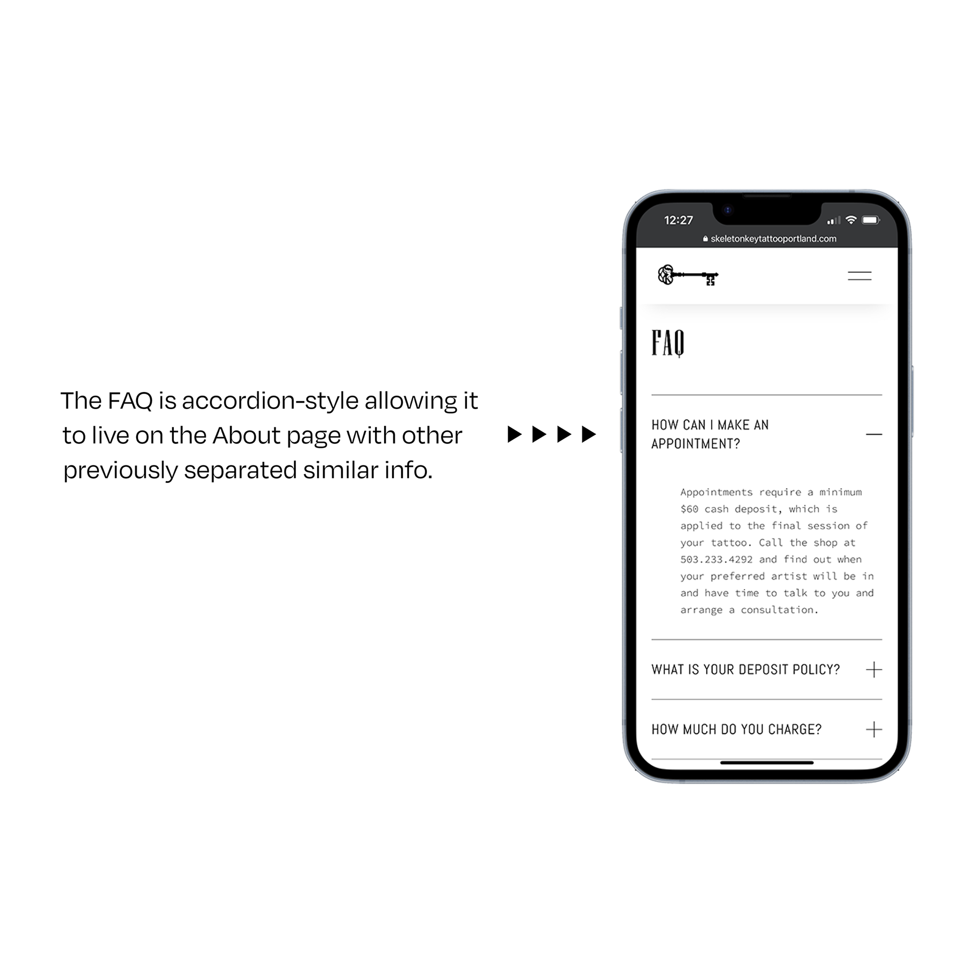
I was able to simplify the Site Map to three primary links containing all of the essential related information. The Artists page absorbed the Portfolios and Bios. I then created interactive accordion drop-down lists on the About page to host the FAQ, shop info, aftercare instructions, and other services offered.
The CTA form and Contact button to book services were prominently displayed on each page and in the top left of the sticky navigation menu to facilitate both the user and business goals of booking tattoo appointments.
What I did
• Information Architecture
• Personas
• Competitive Analysis
• HTML/CSS
• CMS Management
• SEO & Analytic Research
• Branding & Identity Design
• Illustration
Tools
• HTML/CSS
• SquareSpace
• Illustrator
• Photoshop
• Procreate
Strategy
Together we conducted an audit of their previous website and explored local competitor websites and branding.
Competitive Analysis
We looked at other local tattoo shops to see what their branding and UX strengths and weaknesses were.
Persona
I focused on the motivations and goals of the owner of the shop as she is an artist and tattoo enthusiast of 20+ years and understands her target audience better than anyone.
Logo Ideation Journey
Final Logomarks
Final UI Screens & Website
Reflections
I learned much working with Ximena. We took a deep dive into exploring the identity of her shop and other local shops. This was crucial to curating their online experience into a streamlined process that will help both clients and the business to achieve their goals.
On future projects of this sort, I would love to have the budget and time to explore expanding the website components and design system further.
