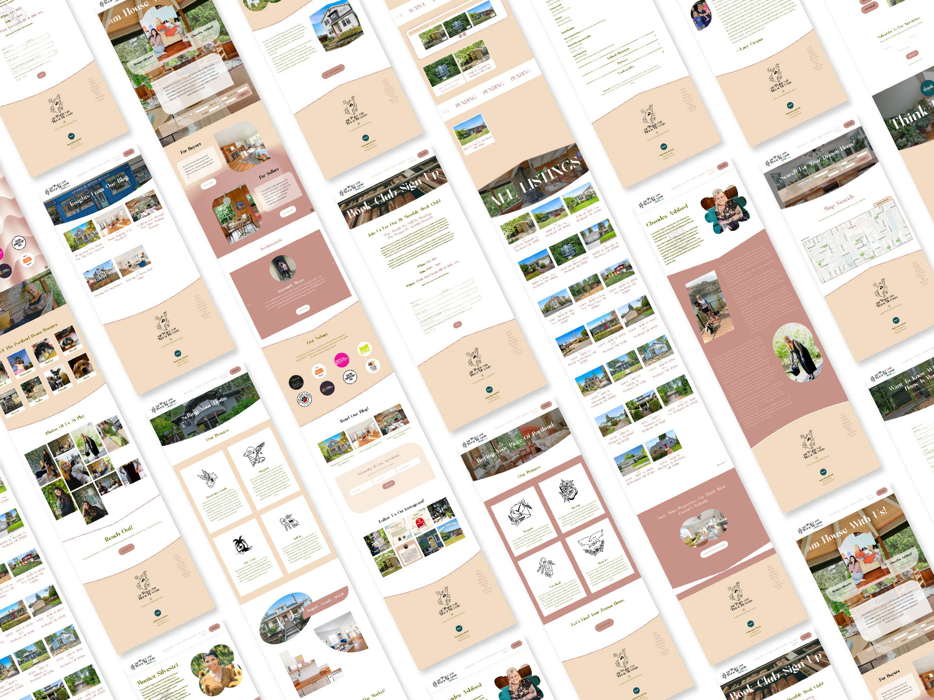
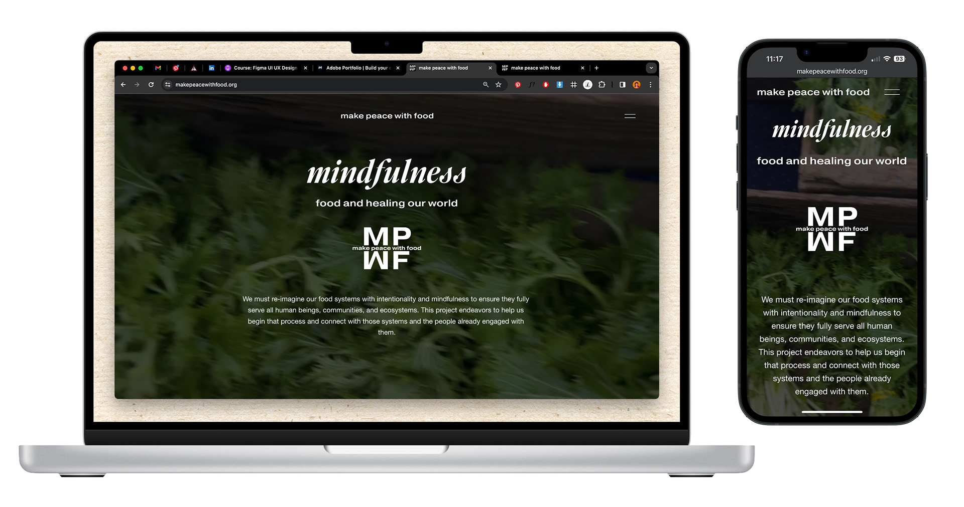
Make Peace With Food
I designed Make Peace With Food as a story-telling website interface and design system with the goal of inspiring users to mindfully re-imagine and reconnect with our food systems, local farmers, communities, and ecosystems. This project was my senior design thesis and the culmination of my time studying design at Portland State University.
The Problem
An immediate challenge was telling the story presented through the robust data in a compelling and coherent narrative flow. The interface needed to be educationally evocative while also conveying the hopefulness and connection the project is meant to inspire.
The Solution
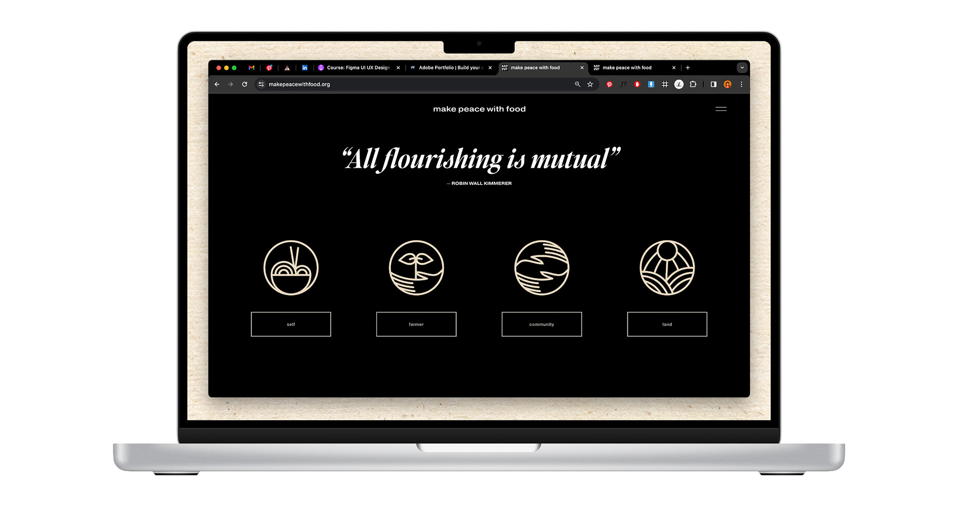
After a vigorous research process, I utilized the principles of Design Thinking to develop a strategy for organizing the website into four narrative sections with external about and resources sections.
I conducted extensive research gathering qualitative and quantitative data to discover users' wants and needs and used this data to create the positioning archetype, site map, and user flows. Using these I was able to iterate often ensuring the interface provided the best user experience while clearly communicating the organizational mission.
What I did
• UI Design
• UX Prototyping
• Primary, secondary, & UX Research
• Information Architecture
• Wireframes
• Competitive Analysis
• Branding & Identity Design
• Digital Illustration
• HTML, CSS, & Squarespace CMS
• Copywriting
Tools
• Figma
• Photoshop
• Illustrator
• Squarespace

Research
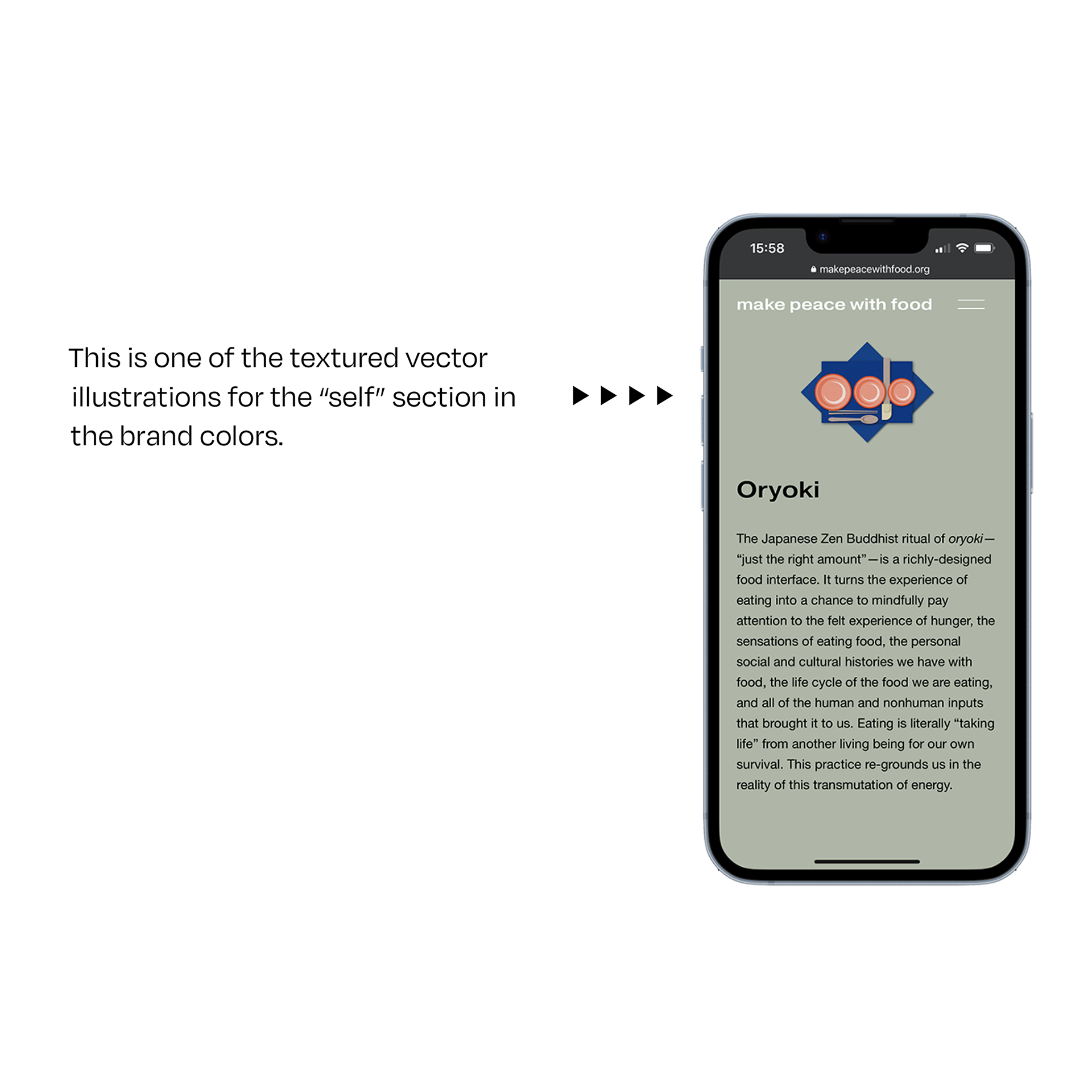
This stage included qualitative research such as personal experiences from a Zen Buddhist mindful eating retreat at Great Vow Zen Temple and practicing Japanese oryoki, interviews with local farmers, food producers, and farmer's market managers. I also conducted extensive quantitative research including books, articles, and podcasts.
Strategy
I determined a strategy to systematize the information into four sections relating to a design system of symbolic icons and vector illustrations.
Audience
1. Progressive consumers
2. Socially-engaged citizens
3. Local farmers, food producers, & farmer’s markets
4. Educators
5. Artists & Designers
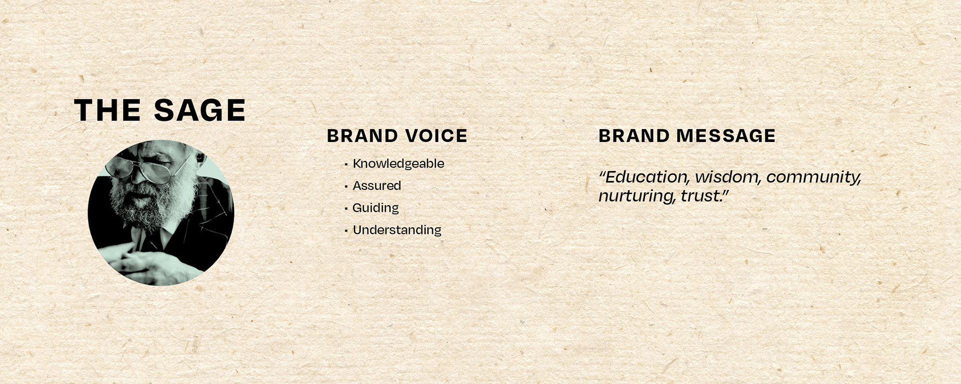
Positioning Archetype
Establishing goals to promote community action through education led me to the strategic position of the sage archetype. This in turn helped to define the visual identity and information architecture of the interface.
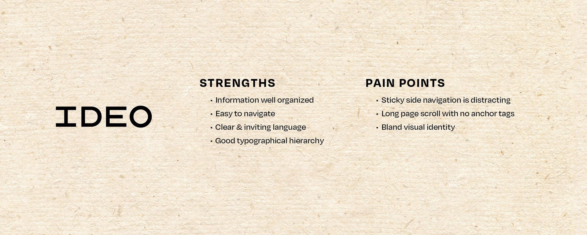
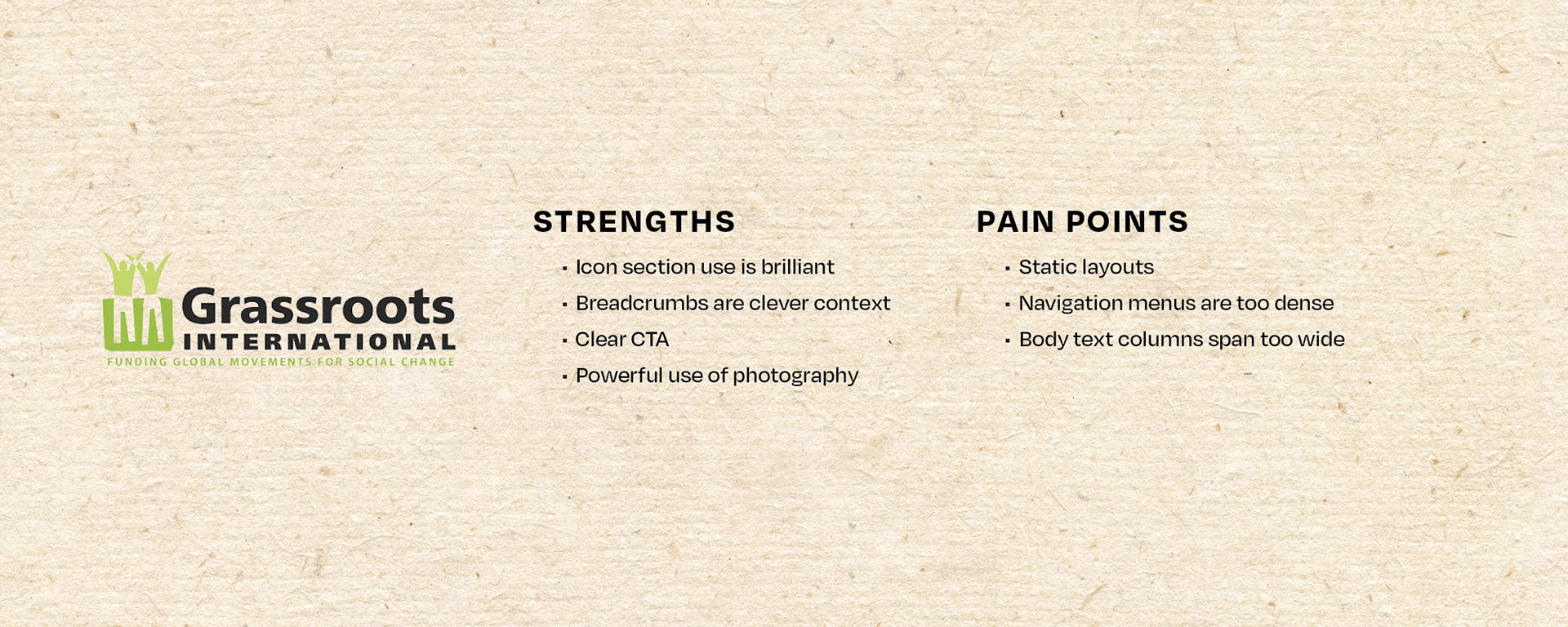
Competitive Analysis
Understanding the audience and how to appeal to them required understanding the interactive and visual language that they would be familiar with so that they would recognize what was being communicated.
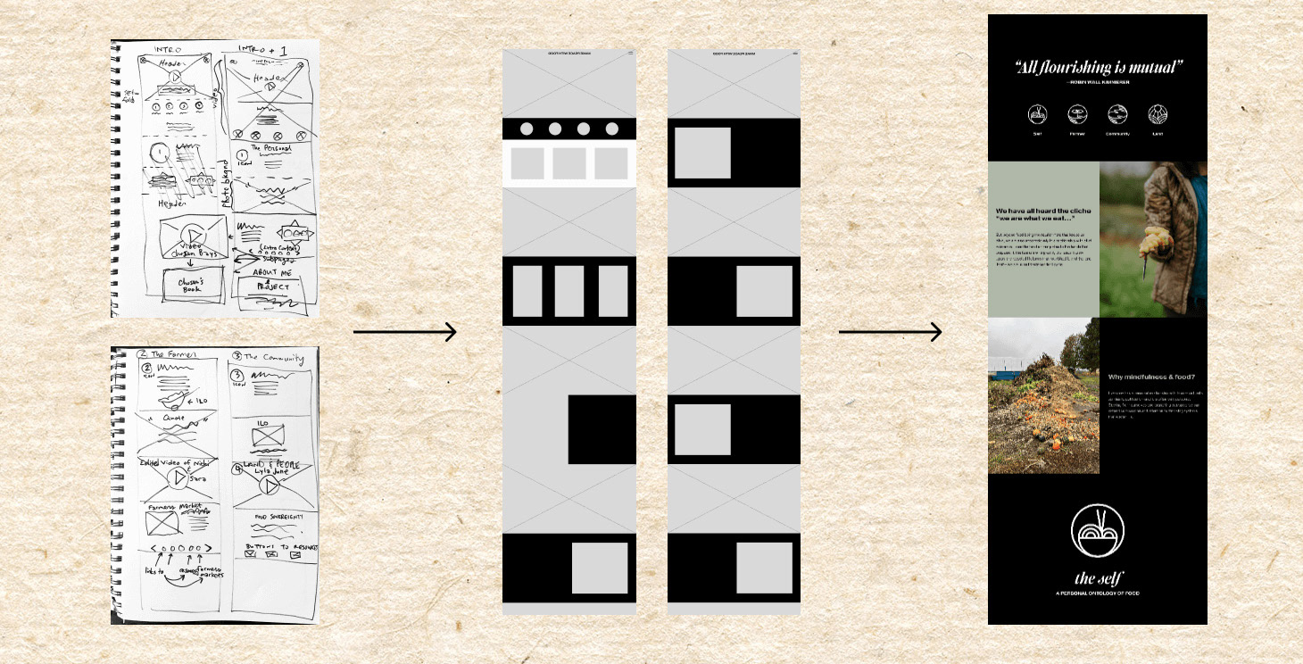
Wireframes
Hand sketches to digital low-fi and high-fi design comps in Figma.
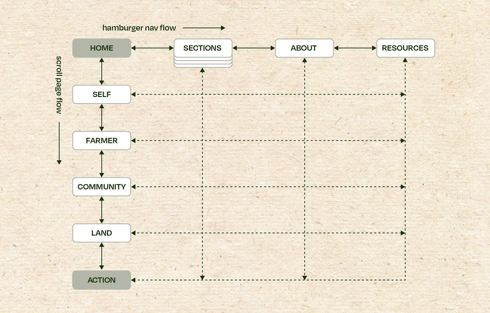
Sitemap
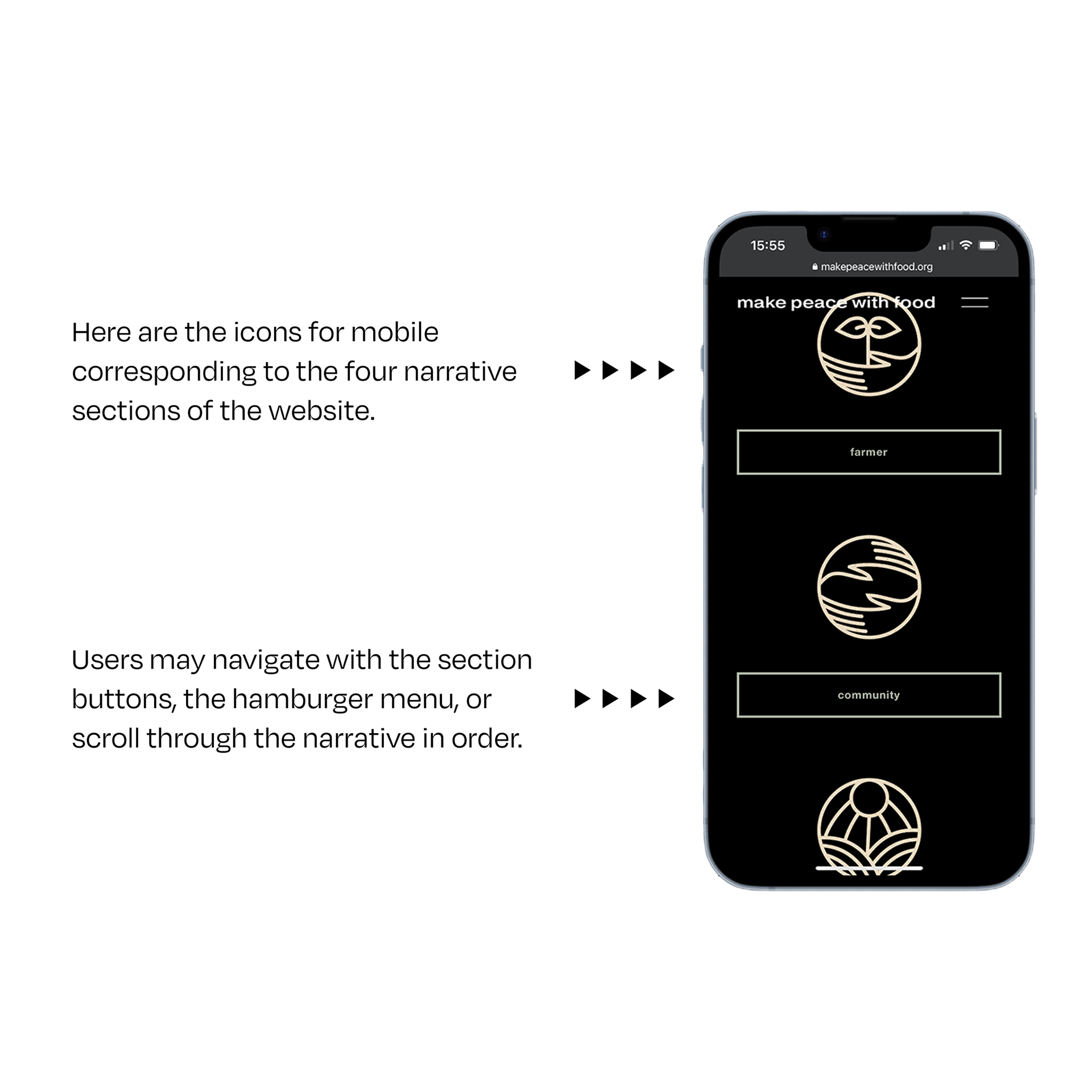
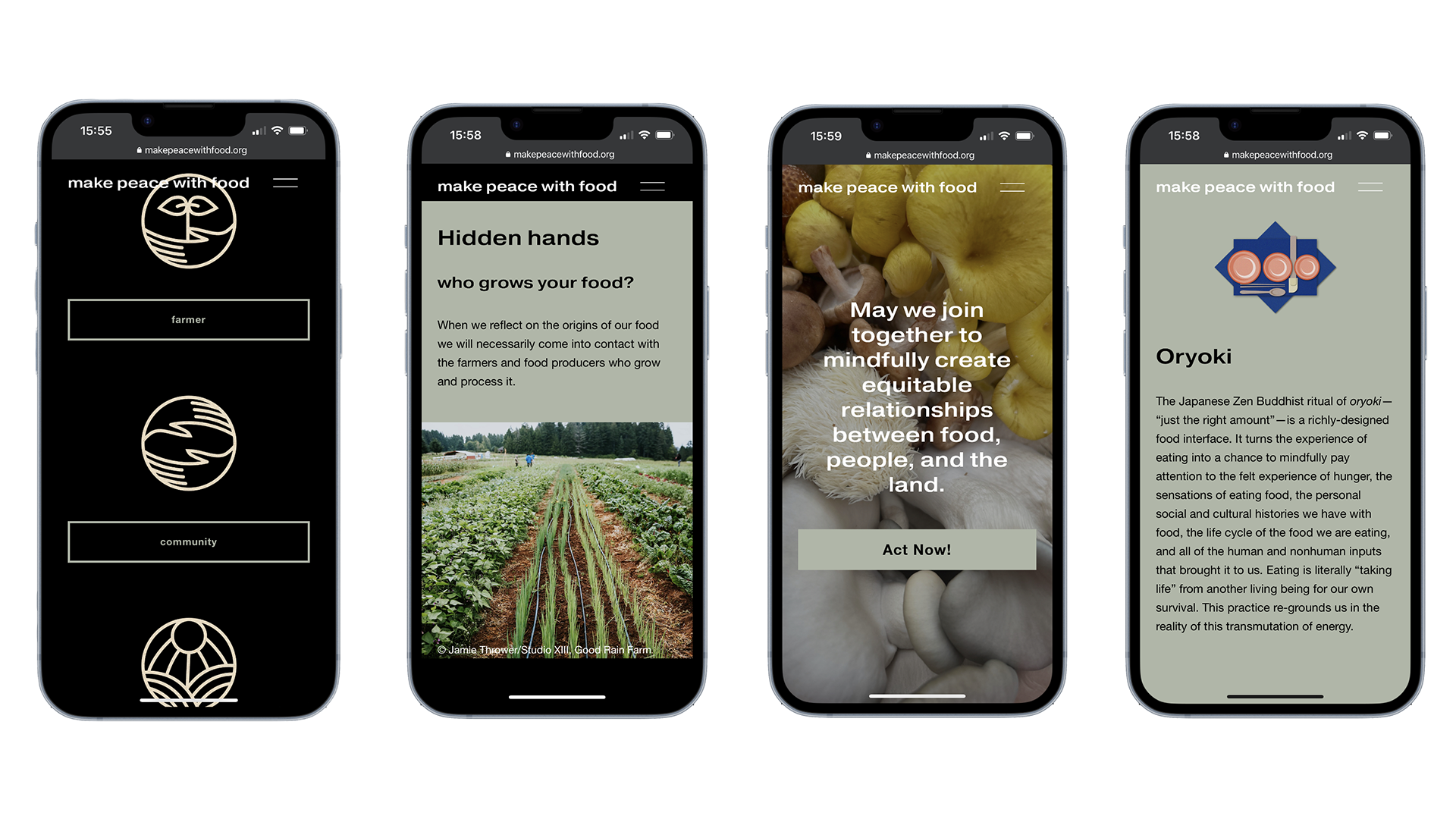
With an emphasis on accessibility, I created the information hierarchy to offer several user journeys—a linear page scroll through the four sections of the page, an introductory hero section with buttons for each section below their corresponding icons, and a global sticky navigation hamburger menu to quickly change course with ease.
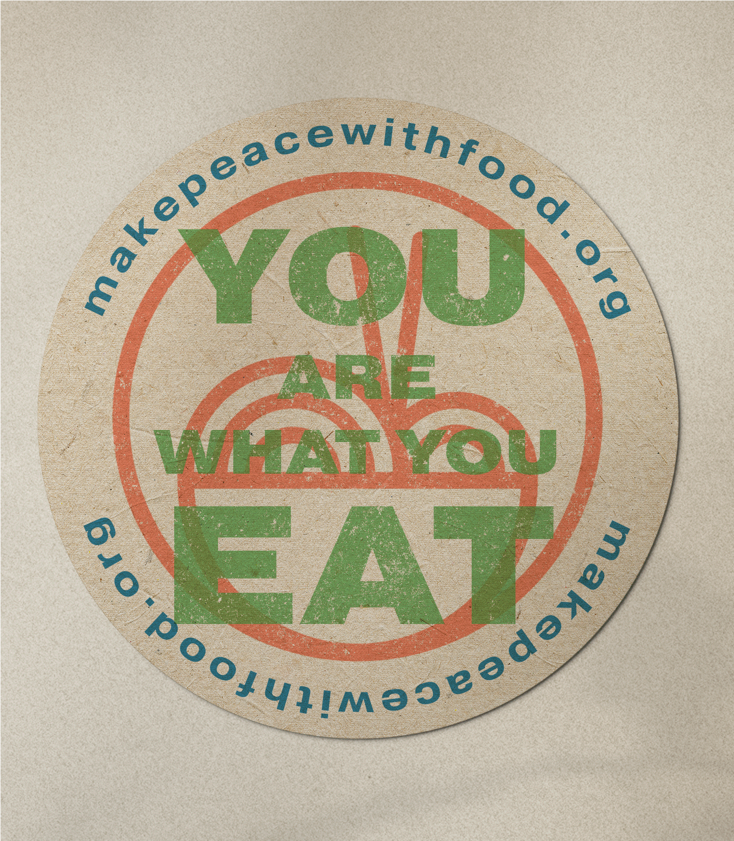
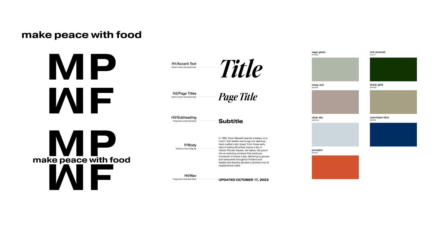
Brand Identity
My process involved ideation and exploration from sketches to refined icons and illustrations, leading to the final designs for the logo mark, typefaces, and color palette. Choices were made with the goal of communicating trust and sophistication.
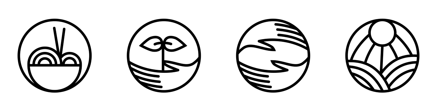
Icons
Bespoke icons for each site section:
(in order left to right)
(in order left to right)
1. The Self
2. The Farmer
3. The Community
4. The Land
These icons encompass a larger design system for print and other branding collateral including posters, stickers, shirts, and more.
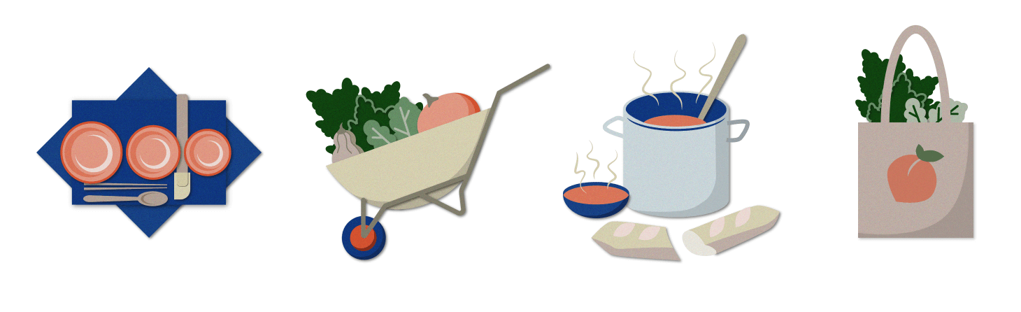
Spot Illustrations
Clean vector illustrations with a hint of texture to add organic character that each correspond to the aforementioned site sections:
(in order left to right)
(in order left to right)
1. The Self
2. The Farmer
3. The Community
4. The Land
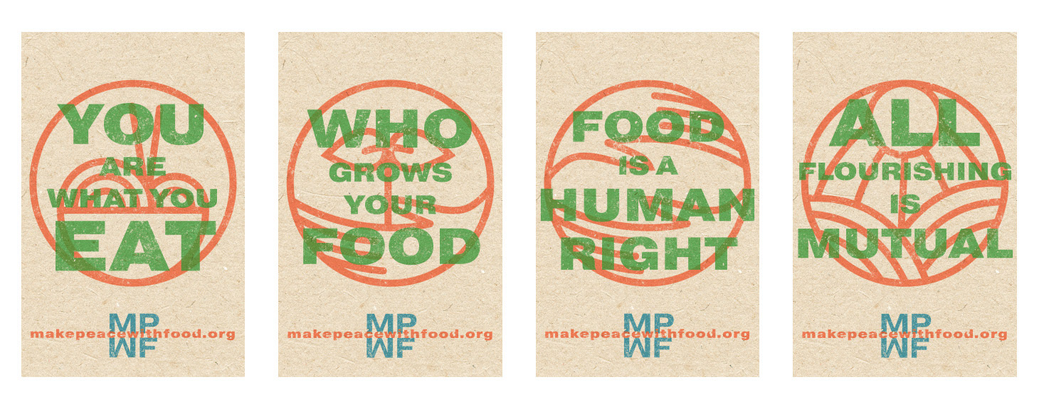
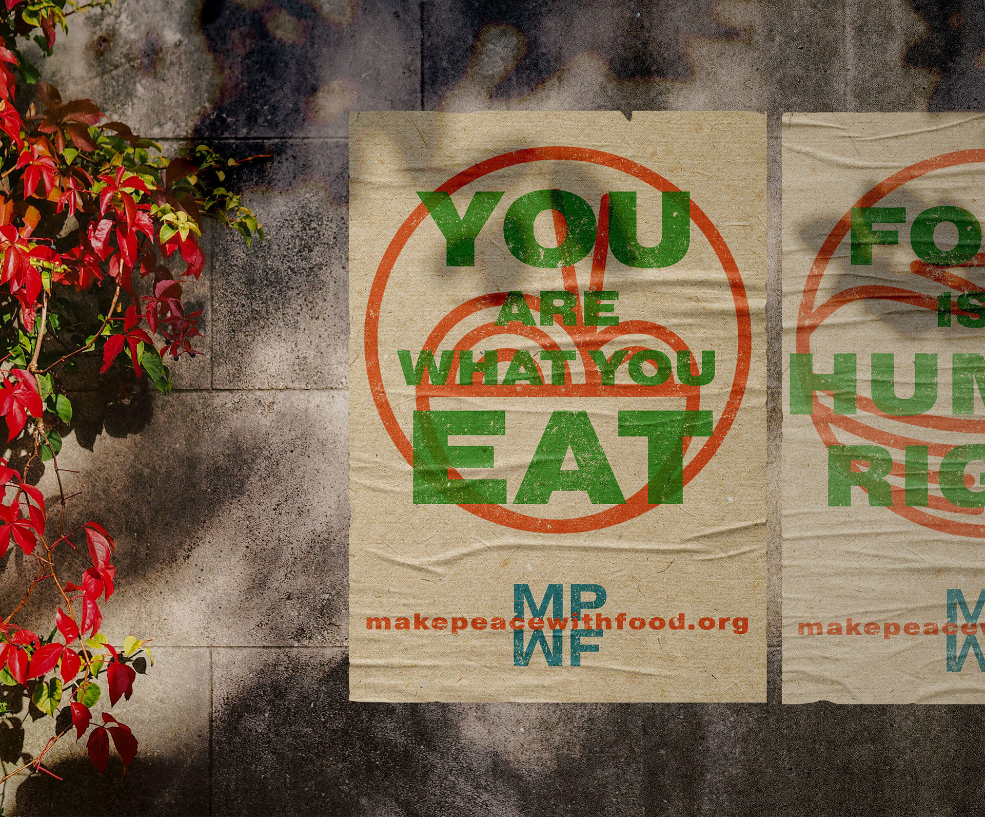
Posters
Inspired by the 1930s Depression-era WPA posters, the logo marks and type treatments work in both digital and analog platforms.
Reflections
Building this website was an exercise in growth. Every stage benefited from careful consideration and mindfulness—from initial research all the way to high-fidelity design and coding. I put a lot of thought into the ability of the design system components to translate to other mediums outside of their digital habitats.
I made this site with the intention of fostering dialog and community action and I sincerely hope it succeeds in moving users toward a more mindful and interconnected relationship with food, one another, and our ecosystems.