INSPO
INSPO is an ideation app that I designed to propel creatives to think beyond the mundane with randomized prompts based on the "Oblique Strategies" card deck devised by Brian Eno and Peter Schmidt in the 1970s and inspired by Yoko Ono's groundbreaking 1964 conceptual art book "Grapefruit". I completed this project as part of a design brief for a User Experience Design class at Portland State University under the guidance of Professor Thom Hines.
The Problem
Many creatives find it hard to start a project from the blank page state. Other ideation apps like Pinterest, Behance, Dribbble, and Instagram can spark inspiration but often add to the feeling of being overwhelmed with their focus on social media, product marketplaces, and doubling as portfolio sites.
The Solution
Through many rounds of research, competitive analysis, personas, and user testing; I created a UI system that helps users explore creative prompts and pin ideas for later without distractions from the ideation process. This application is a love letter to creatives.
What I did
• UX Testing
• Research
• Wireframes
• Information Architecture
• User Flows and Journeys
• Competitive Analysis
• UI Design
• Interaction Design
• Motion Design
• Branding & Identity Design
• Illustration
Tools
• Figma
• Photoshop
• Illustrator
• AfterEffects
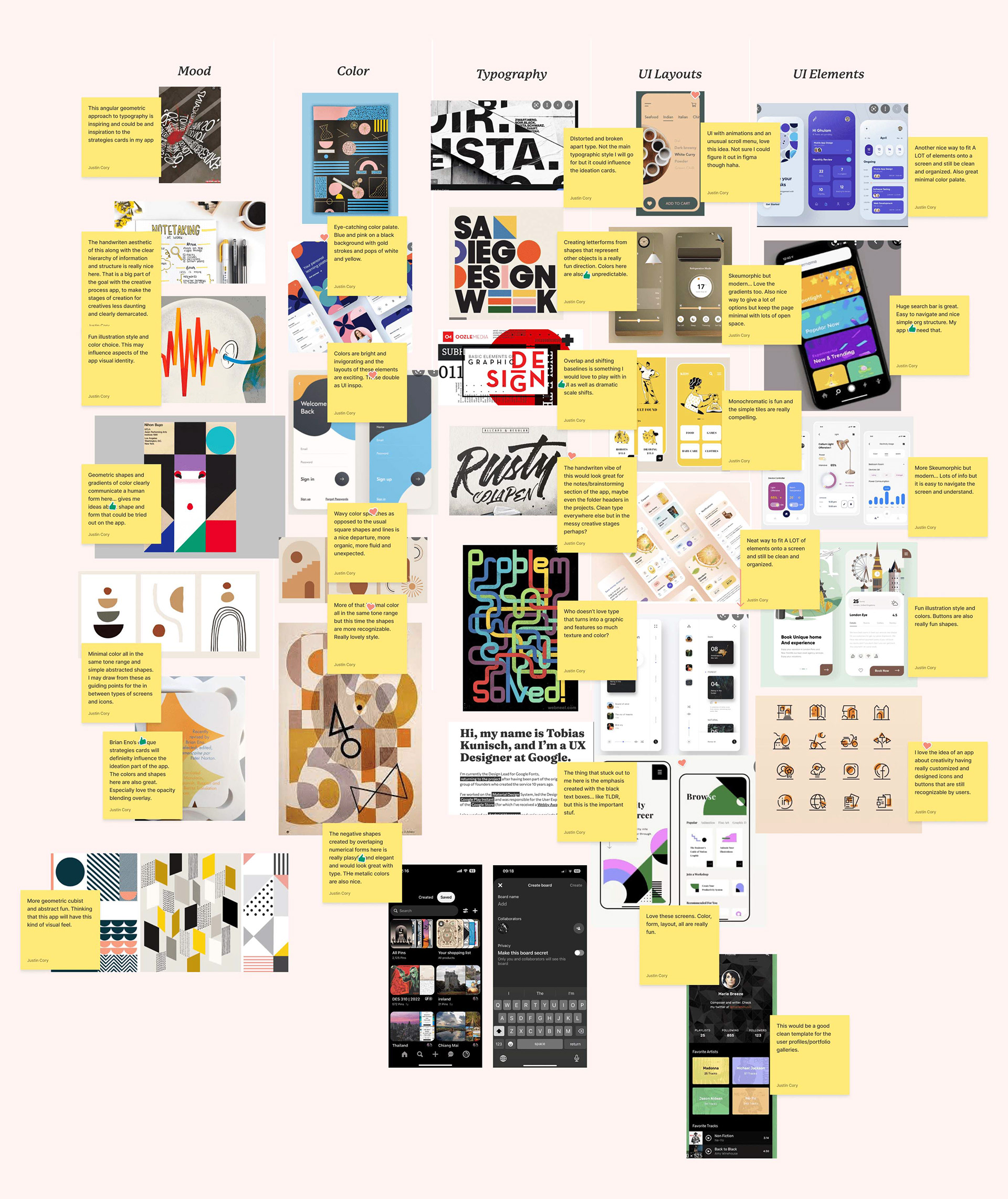
Annotated Research
I love starting with research to determine best practices, compare successful product user flows, and build a coherent aesthetic identity. For INSPO I researched the Mood, Color, Typography, UI Layout, and UI Elements of similar/competitor apps and then created a FigJam Board where I wrote annotated notes detailing what I felt worked about each of them. They were then subjected to a review process by other designers in the class and the professor to gain wider perspectives and insights.
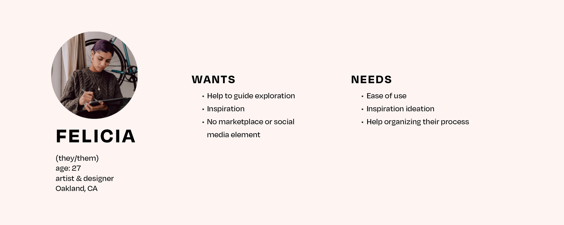
Persona
Empathizing and understanding the wants and needs of users helped ensure that the user experience was tailored to their goals.
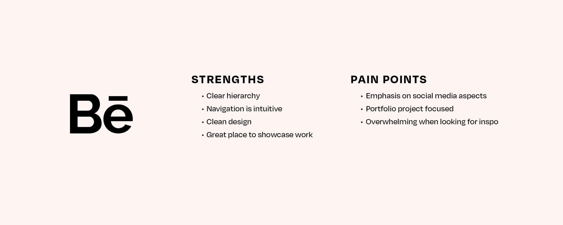
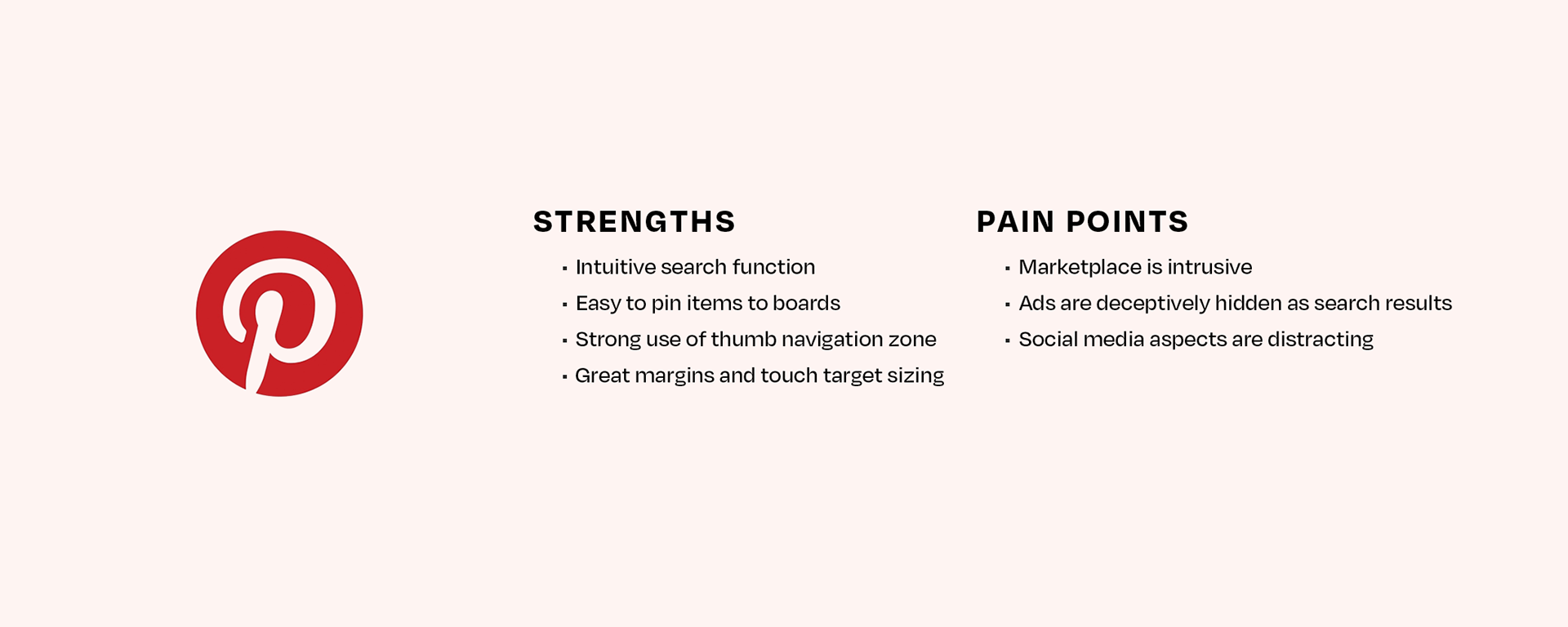
Competitive Analysis
Building on the strengths of similar products while carefully examining and avoiding pain points helped me create an elegant, intuitive, and fun experience.
Information Hierarchy & Site Map
It was important to learn from the strengths of other apps keeping the app navigation intuitive while learning from their weaknesses and pain points.
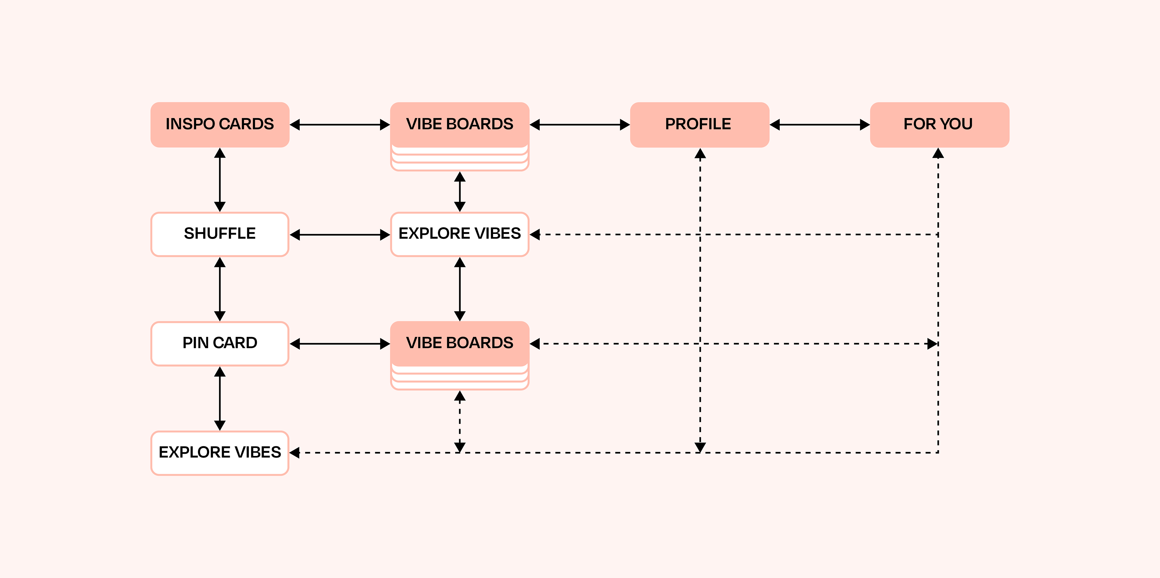
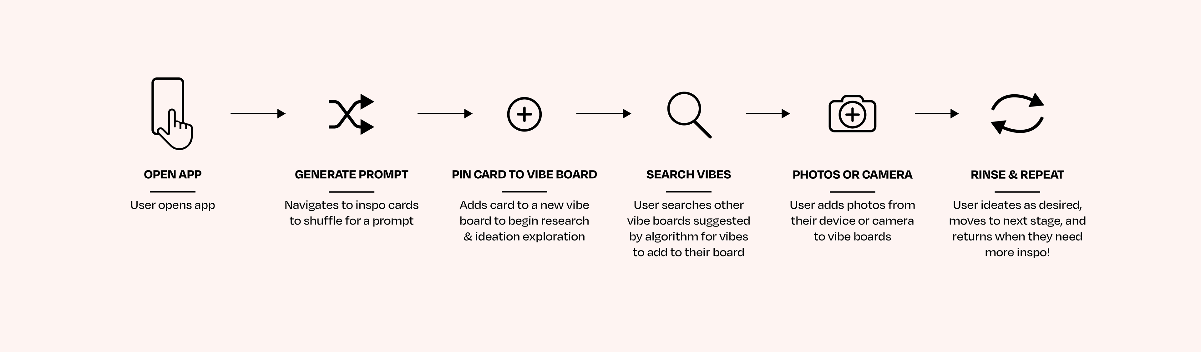
User Flow
I created extensive user flows to visualize and design the user journey at each stage. This user flow demonstrates the process of generating an INSPO prompt by shuffling the cards and then pinning vibe concepts inspired by that prompt to the user's vibe boards.
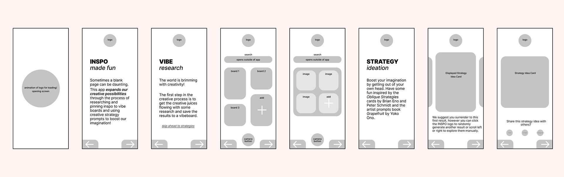
Wireframes
Wireframes gave me the ability to focus on the user journey and essential content before diving into the aesthetics.
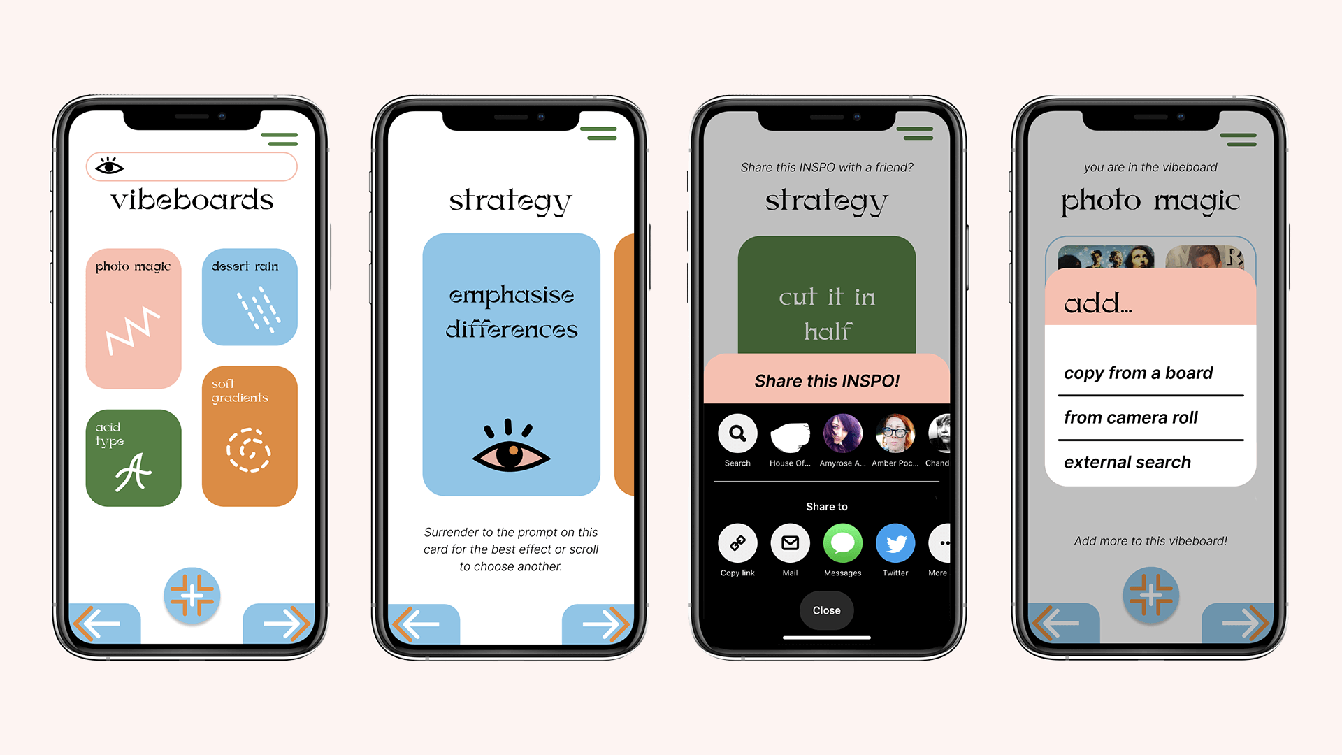
Figma Prototypes R1
User Testing Feedback R1
I conducted several user tests of these prototypes and received the following feedback.
• Buttons were not easily identifiable as interactive components
• Share function is social media gamification/contradicts user needs
• Add from camera roll user flow was confusing
• Leaning more on UI conventions would greatly help usability
• Header display typeface is playful but hard to read
Figma Prototypes R2
User Testing Feedback R2
Another round of testing and feedback yielded further insights.
• Header display typeface is not legible
• Navigation system is hard to understand/too minimal
• Header display typeface is not legible
• Contextual helper text is too vague
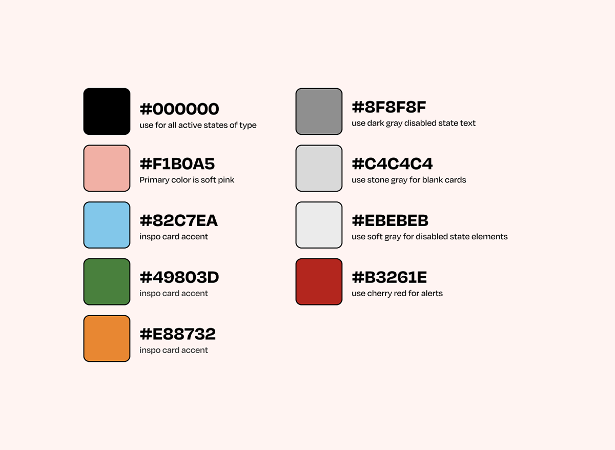
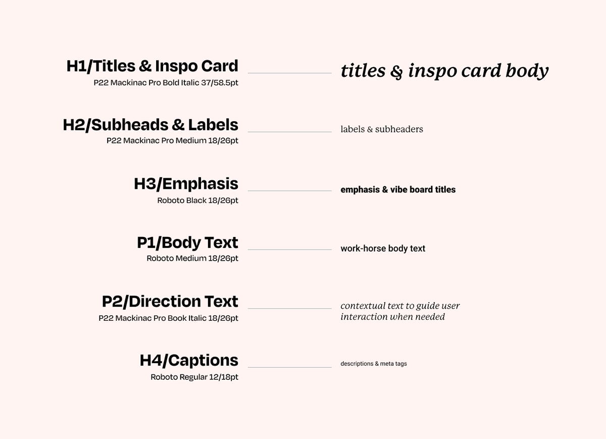
Branding System
I chose to create an aesthetic of play and whimsy with the color palate and imagery. In contrast, the use of white space, margins, interactive components, and typographical systems fit established UI conventions that clearly communicate to users how they can playfully interact with the product.
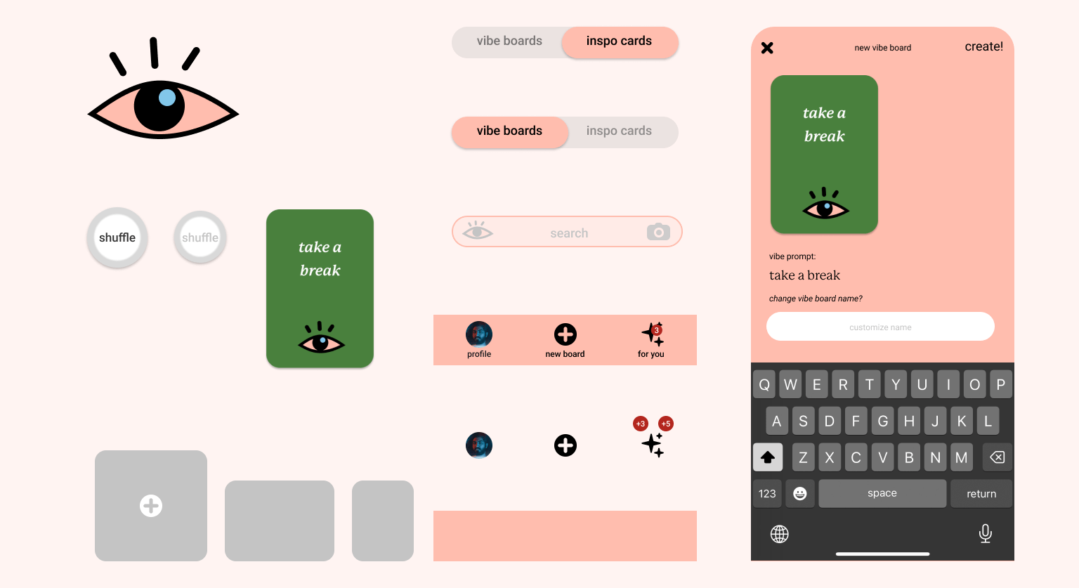
Components
Influences from tarot combined with UI conventions gleaned from Pinterest and Behance united to create this unique take on familiar UI components.
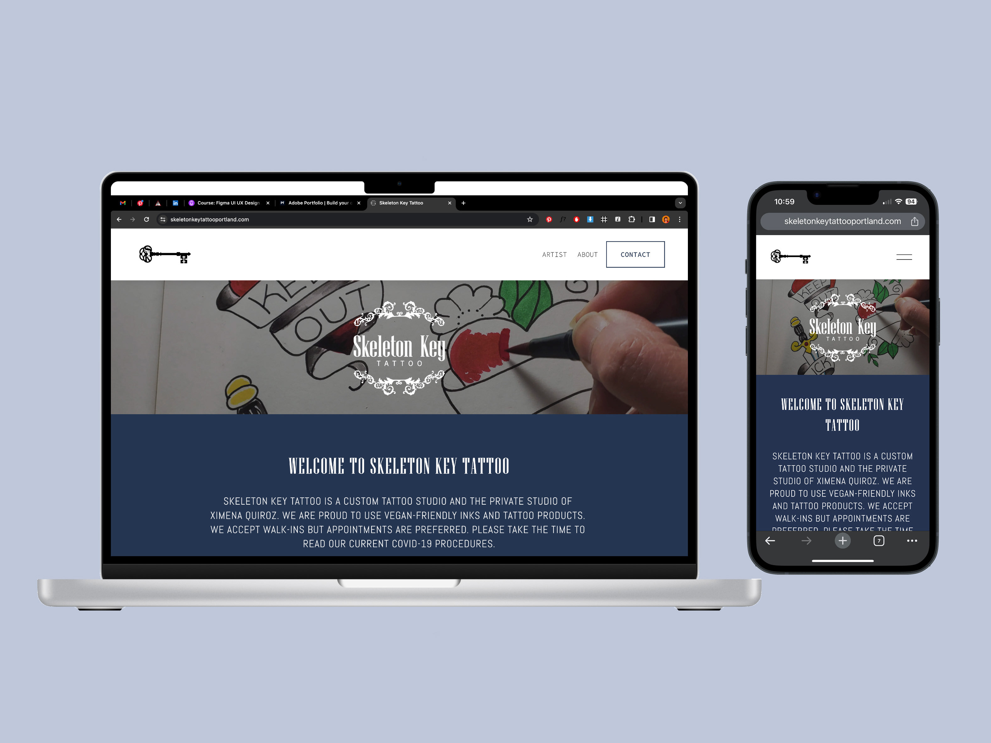
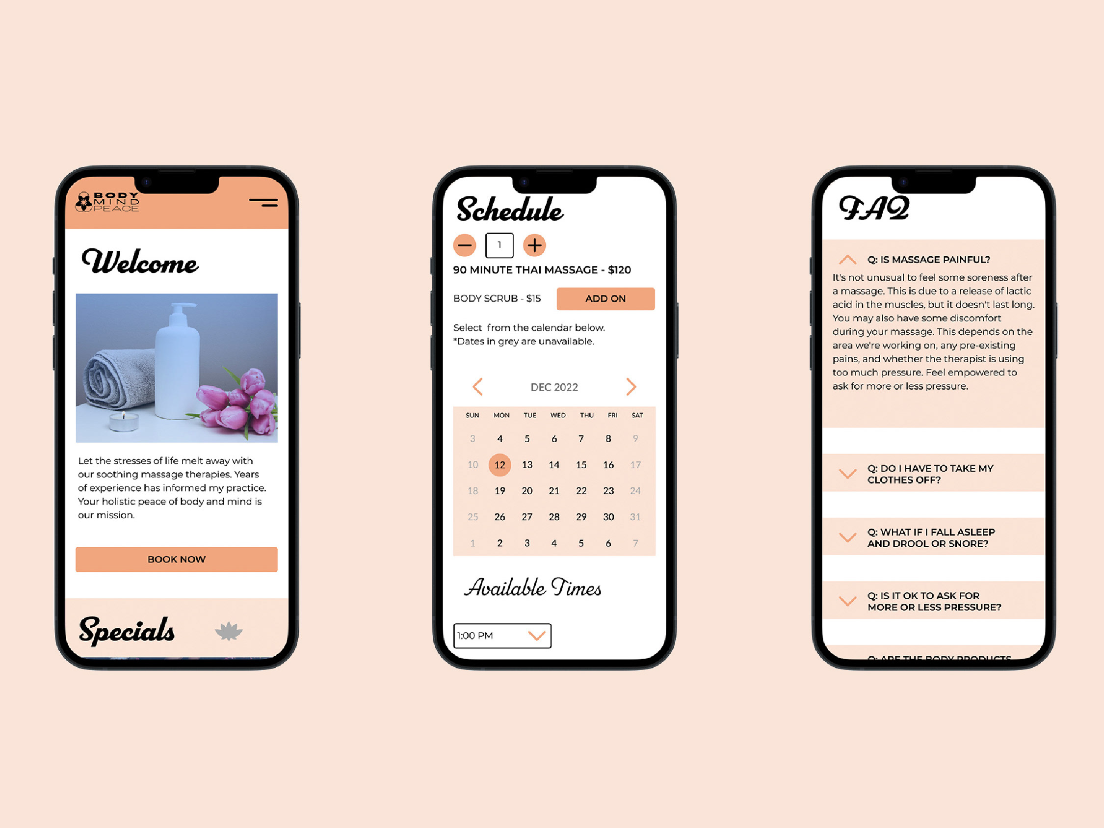
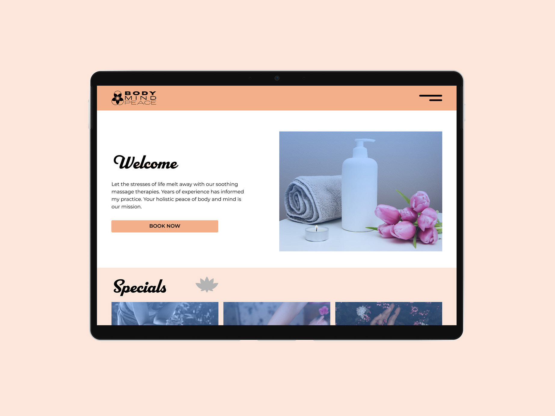
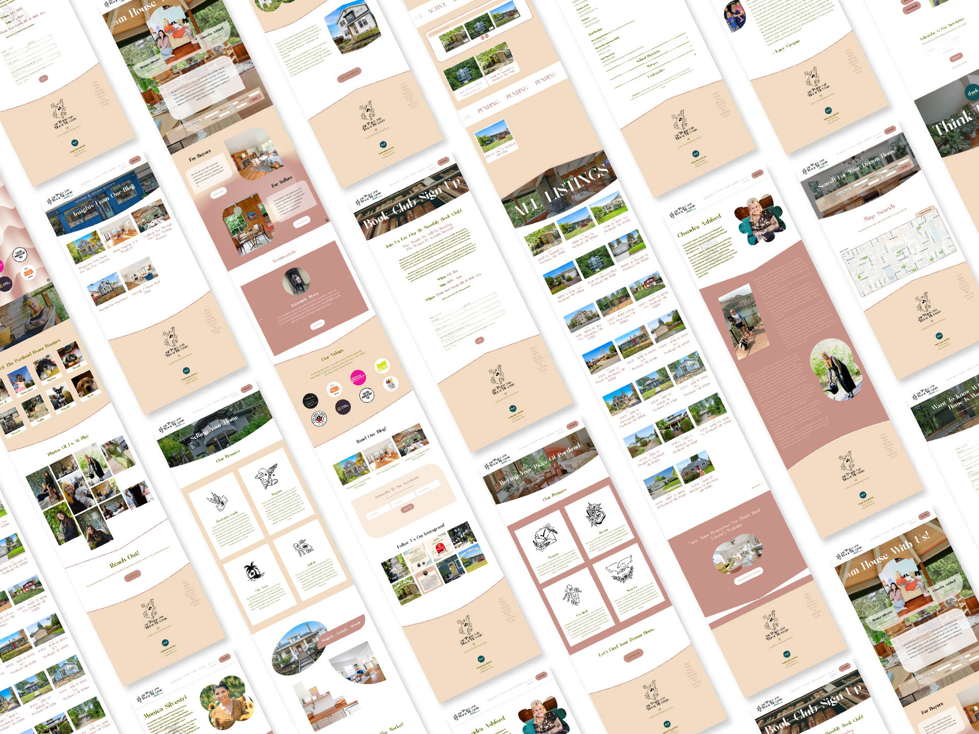
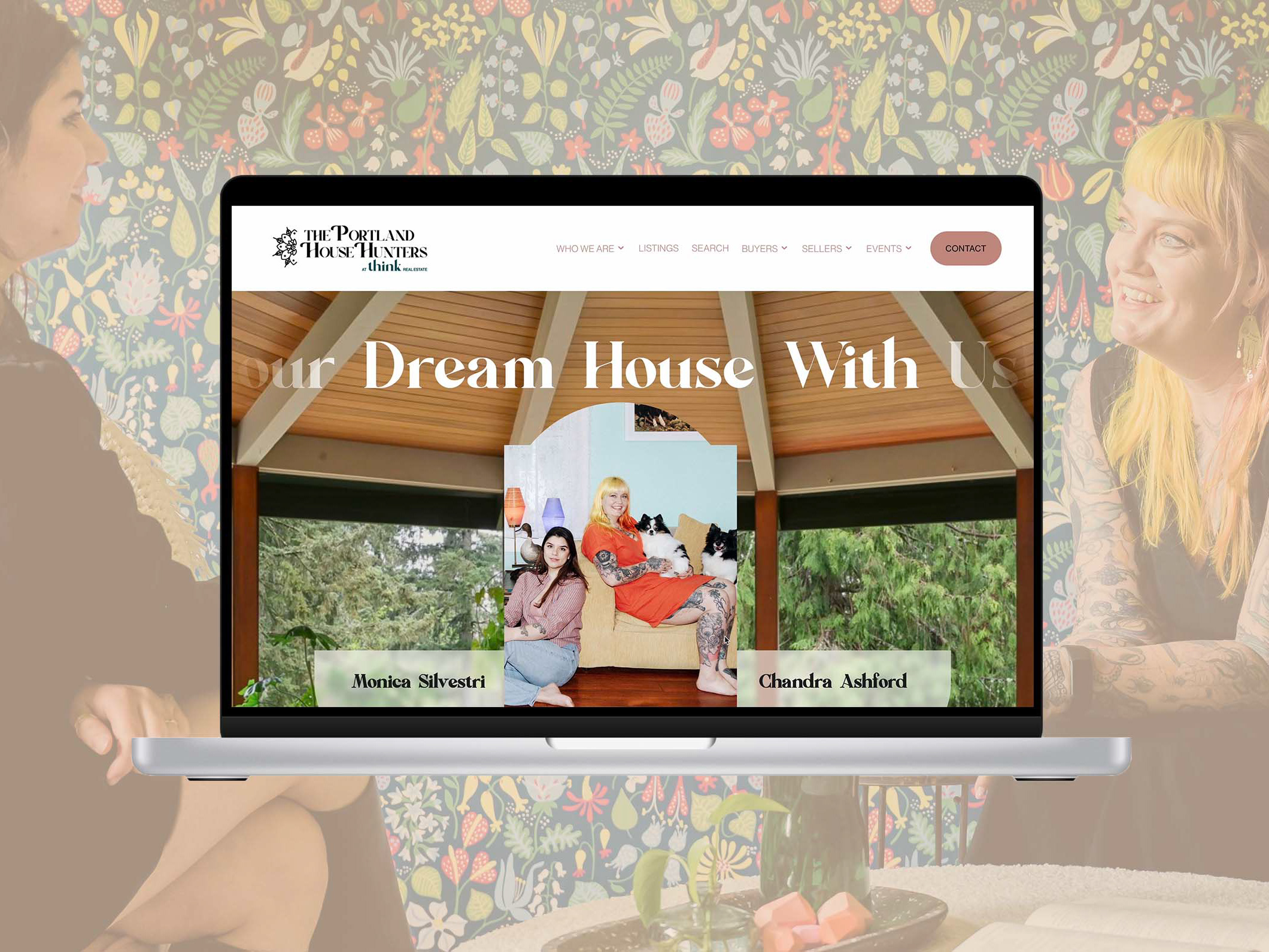
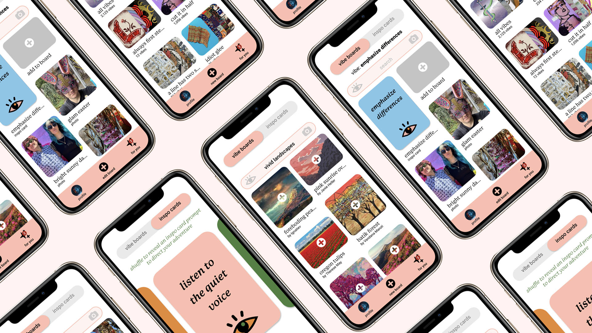
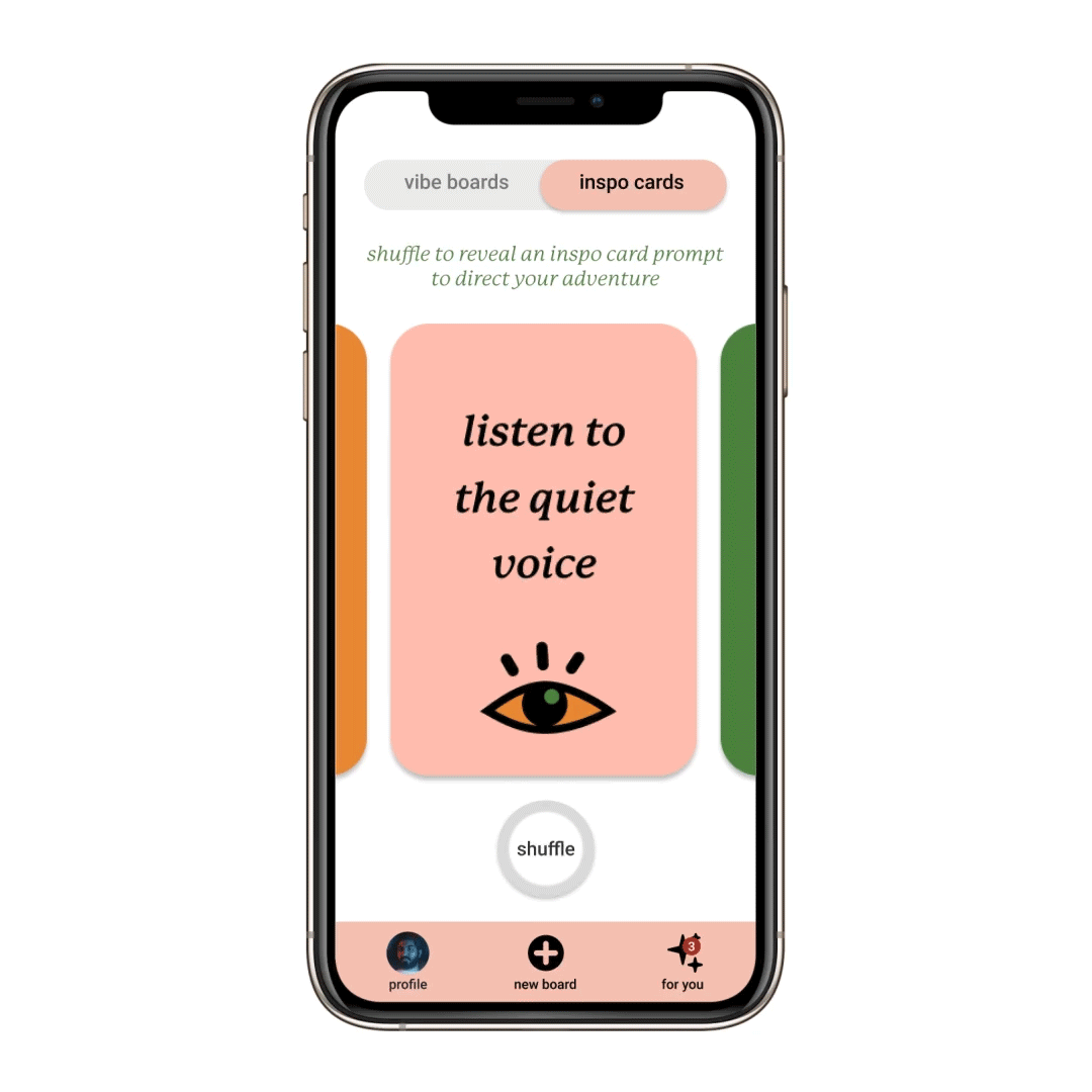
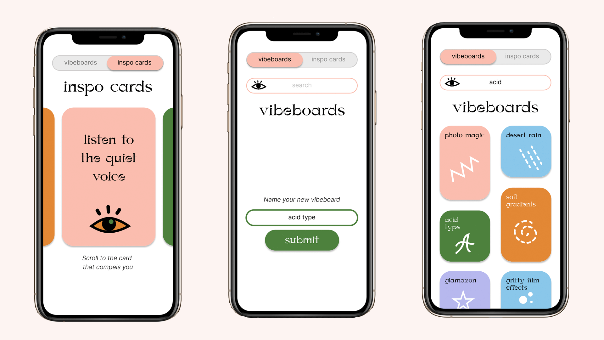
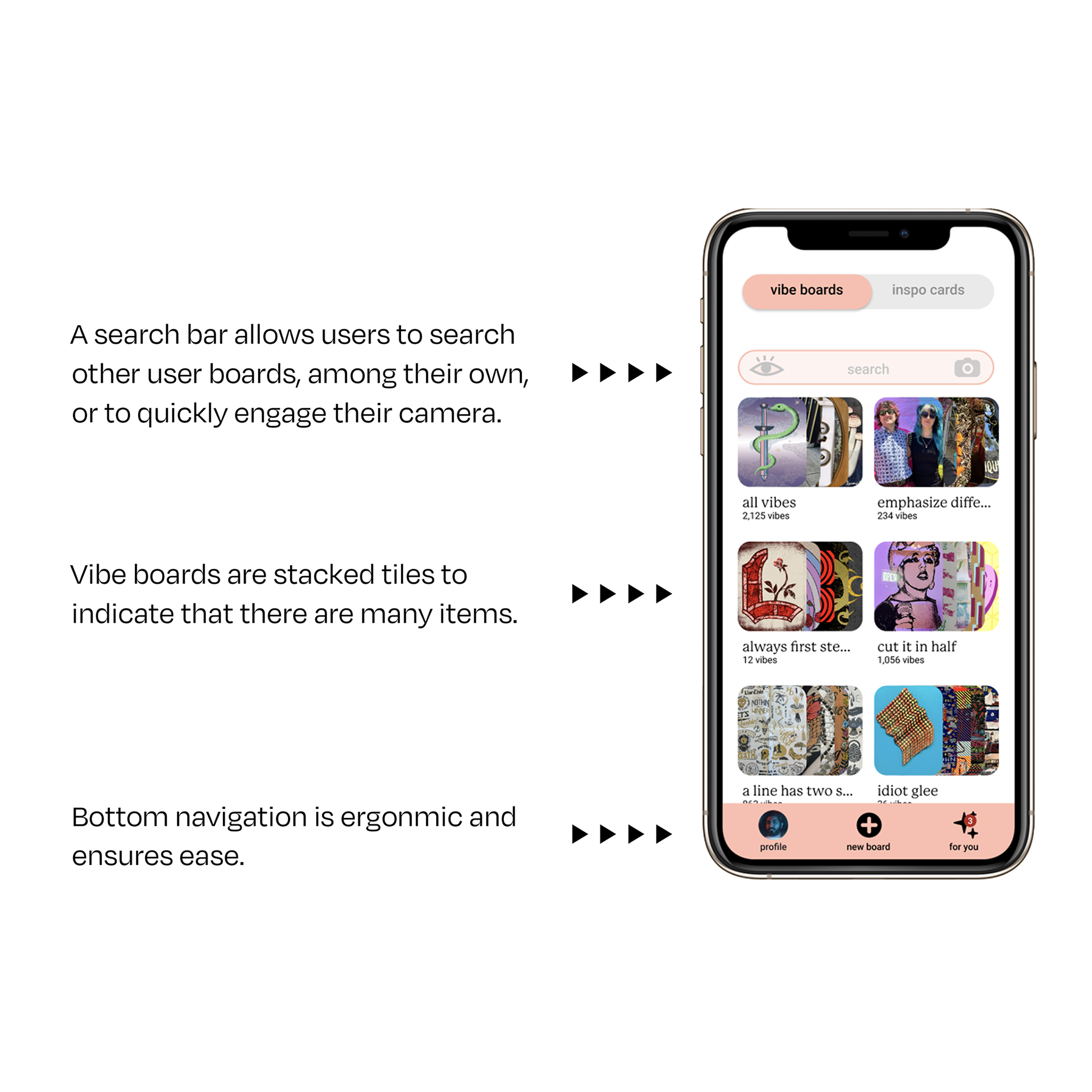
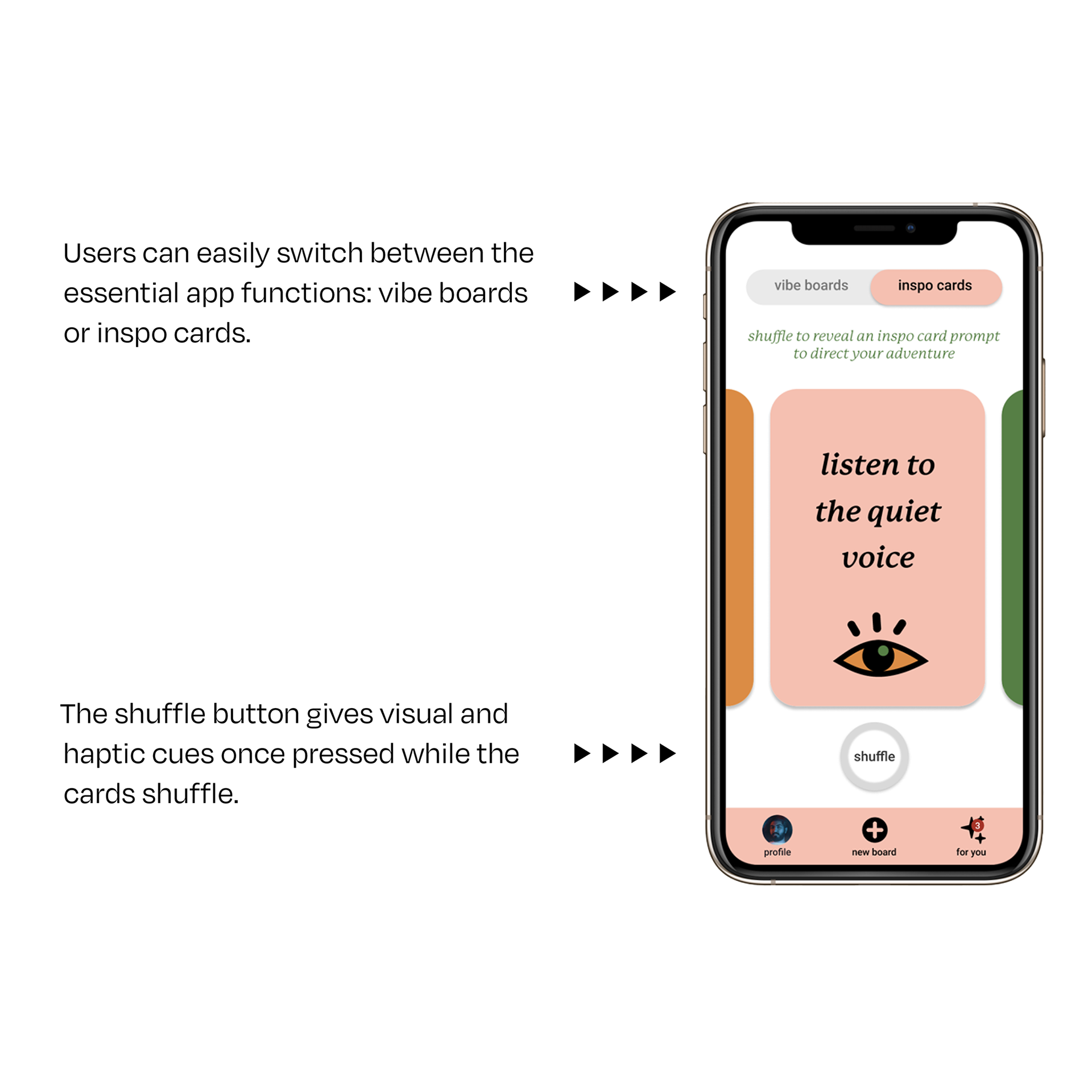
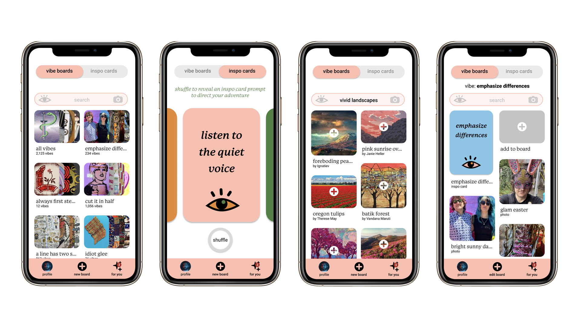
Final UI Screens
Reflections
The value of strong visual hierarchy and intuitive UI components was the key lesson from this project. Earlier stages pushed interactive components far from conventional UI. I learned through the several stages of User Testing that I needed to adhere more closely to UI conventions to improve usability and increase visual consistency.
Sometimes designers want to reinvent the wheel, and that is especially true when given the freedom of parameters that most creative briefs have in the educational setting. This project reminded me that User Experience has to center on the needs/wants of the user, not the designer.